Thursday, 21 March 2013

How first time buyers have lost out to home owners and what we could do about it

The Chancellor yesterday announced that the government would set up a mortgage guarantee scheme to make it easier to buy a house. Unlike previous schemes this will be open to those who already own a home as well as first time buyers, and there'll be a consultation on the details before the scheme launches in early 2014.

The extra subsidy for purchases by those who already own a home is interesting, since as a group they already seem fairly well served by the existing mortgage market - and they have massively expanded their share of that market over the last twenty years. The chart below, based on data from the Council of Mortgage Lenders, shows the trend in the share (by value rather than number of loans) of mortgages for 'home purchase' (i.e. excluding buy to let) between 1993 and 2012. 'Home movers', i.e. those who already own a home, accounted for 52% of the market in 1993 and 66% in 2012 (though note there was a change in how the data was collected in 2005).

Trend in home mover and first time buyer shares (by value) of UK mortgage lending (dashed lines indicate change in methodology in 2005)
When talking about 'squeezed-out' first time buyers the rise of buy to let gets all the attention, too much so I think, but going by the numbers the expanding market share of home movers may be a bigger issue.

So why has lending to home movers expanded so much? A new academic paper by Professor Geoff Meen, one of the country's leading authorities on housing markets, offers a partial explanation. He argues that
existing owners benefit particularly at a time of rising prices, because they are able to use the accumulated equity in their current properties to relax the constraints on their budgets and can, consequently, trade up-market or purchase additional properties. These further demands for housing will put upward pressure on prices and will be accompanied by added demands for mortgage debt by existing owners. Since new households do not have these advantages, the share of mortgage debt which they obtain falls and they also suffer from the rise in prices.
So basically, home owners benefited disproportionately from the long house price boom of the 1990s and 2000s because they used the increased equity in their homes to put down a bigger deposit, increasing their buying power by enabling them to get bigger and better (in terms of interest rates) mortgages. This increased demand then fed back into house prices and the process continued, in what Meen calls a financial 'accelerator' effect. What's more, some home owners didn't sink their increased wealth into a new home for themselves but instead bought one or more additional homes - so this dynamic also can also help explain the rise of buy to let, not as some unrelated external factor but as the natural result of the hugely unequal accumulation of home equity.

First time buyers, meanwhile, got hit by both rising prices and a shrinking share of the mortgage market. The average time spent waiting to buy went up and the home ownership rate went down. When First time buyers got much of the blame when the market crashed, but Meen argues that "the rise in the debt stock was mainly a consequence of the actions of existing owners", with most first time buyers simply caught up in the consequences. With a crushing irony, the hike in deposit requirements that followed the crash hit first time buyers much harder than home owners.

There's one upside for first time buyers: during an economic downturn prices usually fall faster than incomes (because housing demand is 'income elastic', i.e. demand changes by more than the change in income), and the fall in prices disproportionately reduces the buying power of home owners while bringing some prices within the reach of first time buyers. So in a downturn the accelerator becomes a decelerator and the first time buyer market share can increase, as long as they aren't too crushed by high deposit requirements. And indeed, we do see some signs of first time buyers reclaiming market share in the last few years in the chart above.

It's a simple enough theory, but it seems to explain a lot of important features of the UK's housing market in the last decade or so, from the boom and bust cycle to the falling home ownership rate to the increased proportion of cash sales from all the accumulated equity still sloshing around the system.

But as the accelerator/decelerator dynamic seems rather built in to how UK mortgage markets work, the question of what we can do about it is a tricky one. As noted above, traditional controls on loan to value rates don't really help since they don't constrain home owners with significant accumulated equity. Instead, Meen suggests two things:

  • First, we should increase the housing supply on a widespread and long-term enough basis that it outpaces rising demand from population and income growth, preventing house prices from rising too much and unearned wealth accruing to home owners.
  • But for periods when prices do rise we should look into 'fiscal measures' to reduce the effect of those rising prices on rising demand - measures such as the property tax proposed by John Muellbauer in 2005. This tax would be a constant percentage of each home's value and would rise or fall in line with house prices, so that higher prices wouldn't be a free lunch for home owners.
Both of these seem like they could be quite effective, but given they would primarily hit the home owners who have done so well out of the last boom and who are so good at getting their voices heard in politics, it seems unlikely we'll see them any time soon.

Monday, 18 March 2013

Giving people what they say they want mightn't give them what they want

There's a school of thought which says that since people generally say they want big houses with gardens then that's what we should be building and not small flats in city centre locations. This is intuitively appealing, but the problem is that housing is a composite good: when people buy a home they're not just buying the structure but the location too, and in practice they're willing to trade off one for the other.

The huge price differentials between structurally very similar properties in different parts of the country indicate that people attach a great deal of value to location, and the small flats you see in high-density areas are in large part the result of people willingly sacrificing dwelling space for locational benefits, even if in an ideal world they would much prefer to live in a big house in a garden in the same location.

Making it easier to build more flats in high-density areas makes it easier to find acceptable trade-offs and would be good for people who value central locations, and it would also be good for people who want to live in the suburbs since there will be less displaced demand from the centre. You sometimes see city centre locations trying to restrict the supply of flats and justifying it on the grounds that people say they want to live in houses, but this doesn't get rid of the uneven pattern of locational demand - it just means that high demand in some areas is concentrated on a smaller number of properties so prices go (sorry) through the roof. Trying to give everyone what they say they want (a big house in a low-density area) makes it harder to give people what their behaviour shows they really want (a home that provides some optimum mix of a range of characteristics including structure and location).

There's an analogous situation in transport policy, in that if you asked people what they would like in an ideal world most of them would probably prefer a nice fast drive in their own car from A to B. But the spatially uneven pattern of transport demand means that trying to satisfy this just leads to huge levels of congestion on certain roads. Since what people really want is just a reasonably quick and cheap way to get from A to B, a better policy is to provide public transport on high-demand routes that moves more people without causing (much) congestion.

The lesson is that it's better to understand the aggregate impact of people's choices and learn from the trade-offs that we make, rather than just try to satisfy what we say we would like in an ideal world. Hardly anyone loves buses in their own right, but they do love the ability to get where they want to go. Similarly, most people don't dream of living in a high-density flat but providing these kinds of homes is a vital part of enabling people to live where they want and ensuring that cities stay as affordable as possible.

By the way, none of this is to say that we shouldn't make it easier to build suburban housing too. We should - but the point is that unless supply is increased in response to demand in city centres too then you won't fix the affordability problem.

Saturday, 9 March 2013

The awful truth about buy to let lending

Faisal Islam, Channel 4's excellent economics editor, tweeted this morning
Judging by the number of retweets, this struck a chord with a lot of people, which is not surprising. Since hardly anybody is a buy to let (BTL) landlord but lots of people are suffering from high housing costs, the idea that BTL landlords are gobbling up all the extra mortgage lending and pushing everyone else out is very attractive.

But it's also wrong. The truth is, while lending to BTL increased by £2.6 billion between 2011 and 2012, lending to first time buyers also went up a lot, by £3.7 billion to be exact. So Faisal could just as easily have said that "ALL the increase in mortgage lending over 2012 was to first time buyers", though I imagine this wouldn't have had quite the same impact.

To explain, let's go the sources which Faisal helpfully tweeted:

There are two issues here, one of which is the a relatively minor problem of comparing CML data on BTL lending with Bank of England data on total lending. But the more important point is that BTL is just one component of gross mortgage lending, alongside lending to home buyers (first time buyers and home movers) and remortgaging. It's perfectly possible for lending to both BTL and home buyers to have risen by more than the total increase in mortgage lending, as long as lending for remortgaging falls. And that's exactly what happened in 2012.

The table below shows mortgage lending in 2011 and 2012 by category of buyer, based on CML's press releases on mainstream mortgage lending and BTL. Lending to first time buyers went up £3.7bn, to home movers £1.9bn and to BTL £2.3bn, but because remortgaging fell by £5.9bn the total only went up £2.3bn.

Value in £ millions of new mortgage lending in 2011 and 2012, by category
Re-mortgage  First time buyers Home movers Buy to let All home lending
2011 46,700 23,600 51,700 13,800 135,800
2012 40,800 27,300 53,600 16,400 138,100
% change -12.6% 15.7% 3.7% 18.8% 1.7%
£m change -5,900 3,700 1,900 2,600 2,300

Here's the same information in chart form, which I think puts the supposedly terrifying rise of buy to let into some perspective.


Saying that BTL accounted for all of the increase in mortgage lending is just as much of a fallacy as that tabloid trope of claiming that all the new jobs have gone to foreigners. Both of them are misleading, but they are also hard to kill off because they seem to identify a handy scapegoat for a more systemic problem.

Wednesday, 6 March 2013

The problem with 'transport poverty'

The RAC Foundation have been getting some good press coverage with their argument that we should be very concerned about the 'transport poverty' experienced by low-income households who own cars. Their preferred solution is a big cut in fuel duty, as merely "tinkering" with the rate would be akin to "rearranging the deck chairs on the Titanic" according to their chair Stephen Glaister.

The RACF's argument is based on these statistics from the ONS, showing that there are around 800,000 households in the UK who are in the poorest 10% of households according to disposable income and who own a car, and that these households spend an average of £45 a week on transport, including an average of £16 a week on motor fuel. As these households all have a weekly income of less than £168 (see the top row of the table) that means that many of them are spending more than a quarter of their income on transport. The RACF calls this 'transport poverty' and thinks the way to deal with it is to make fuel cheaper.

There are several problems with this argument. First, what the RACF don't tell you is that only 31% of households in the poorest tenth of the income distribution actually own a car, compared to 96% in the richest tenth (see p.9 here). So if 'transport poverty' due to fuel costs is a problem, it is a problem only for a minority of the poor.

Second, it is likely that many of those the RACF say are in transport poverty aren't really that poor after all. Households with very low reported incomes are often there because they have suffered a temporary drop in incomes, but they could still be otherwise reasonably well off. As these academics point out,
for some of those at the very bottom of the income distribution, a recorded very low income should not be taken as a sign of more general lack of resources... It might reflect the fact that some individuals experience very low income for a relatively short period of time, but that they maintain their spending at some sort of long-run level: for example, someone between jobs (who could have a 0 or very low income if measured over a sufficiently short period), or someone making a loss in their selfemployment business (which would count as a negative income).
So it is very likely that many of the low-income households who own cars are only temporarily low-income. But even if we accept that these households really are poor in the usual sense and that enough of them own cars for this to be an issue (no matter how contradictory those two statements might seem), there is a third big problem with the RAC Foundation's argument. The ONS figures they cite indicate that car-owning households in the poorest 10% spend around £13m a week on fuel (830,000 households with an average weekly spend of £16), compared to spending on fuel by all households with cars of around £640m a week (19.7 million households with an average weekly spend of £32.50).

That means the households in 'transport poverty' account for just two per cent of total motor fuel spending in the UK. By contrast, car-owning households in the top 10%, who all have disposable household incomes of over £57,000 a year, account for 21% of total motor fuel spending. So any cut in fuel tax aimed at reducing 'transport poverty' would overwhelmingly benefit the better off.

Cutting fuel duty would be an extremely bad way to reduce poverty, especially if the money has to come from elsewhere. If cuts in fuel duty were paid for reducing benefits then you would be directly transferring money from poor to rich. If the RAC Foundation are really interested in reducing 'transport poverty' then they would be better off arguing for reductions in the cost of transport modes used mostly by the poor (i.e. the bus). But the best and most tried-and-tested way to reduce poverty of any kind is to just give poor people more money.

Monday, 4 March 2013

Mapping cyclist casualty concentrations in London

I've produced some maps of London cycling casualties on this blog before but it's hard to come up with an image that manages to capture both the scale and the spatial specificity of the issue. It matters where cycling casualties happen and it also matters how many there are in a particular area, but at the London-wide level there are so many that the most straightforward visualisation techniques just aren't adequate, even before you start trying to understand the underlying patterns of exposure and causation.

Here, for example, is a simple map showing one dot for every recorded cycling casualty in London over the five years to 2011 (the most recent year available). It includes fatal, serious and slight casualties, with the latter category by far the largest.
This map does tell us some useful things: cycling casualties are heavily concentrated in central London, and judging by the linear patterns seem to be common on major roads too. But there are so many casualties in the centre that the image becomes overwhelmed and you lose a sense of either scale or space. Some kind of aggregation would help.

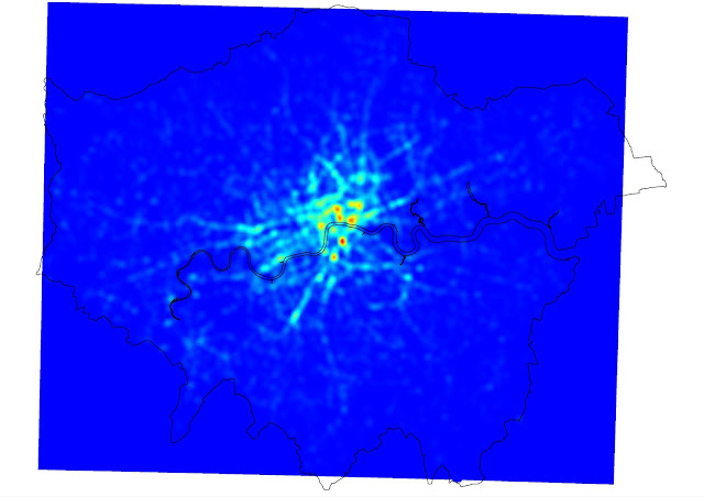
Following the steps outlined on the Mapbox blog here, I generated a 'heatmap' of cycling casualties in Quantum GIS. A heatmap is a technique that uses spatial interpolation to predict the number of events (in this case, cycling casualties) in a small part of an area based on the actual number observed in or close to that area. It smooths out the pattern a bit and highlights with variations of colour the locations with the greatest concentrations.

If anything, this shows even more clearly how many casualties there are on London's major roads (including many of the ancient Roman routes shown recently on the Mapping London blog). I thought it could do with a bit more clarity, so, again following the Mapbox tutorial, I added some definition using contour lines, and a legend.  Note that the heatmap model 'predicts' 140 casualties in the deepest red cells and zero in the deep blue squares that cover most of the suburbs.


Maybe the contours look a bit messy at the London-wide scale but when you zoom into the city centre I think they help, partly by overcoming the blockiness of the heatmap results. In the map below I've labelled the areas in central London with the greatest concentrations of cycling casualties in the last five years. As you can see, the Elephant and Castle area is pretty clearly the worst in terms of the number of casualties, while there is a cluster of areas just north of the river also focused on major junctions.


Finally, here's a version with the street network showing underneath.

Tuesday, 19 February 2013

Animating London's population change 1801-2011

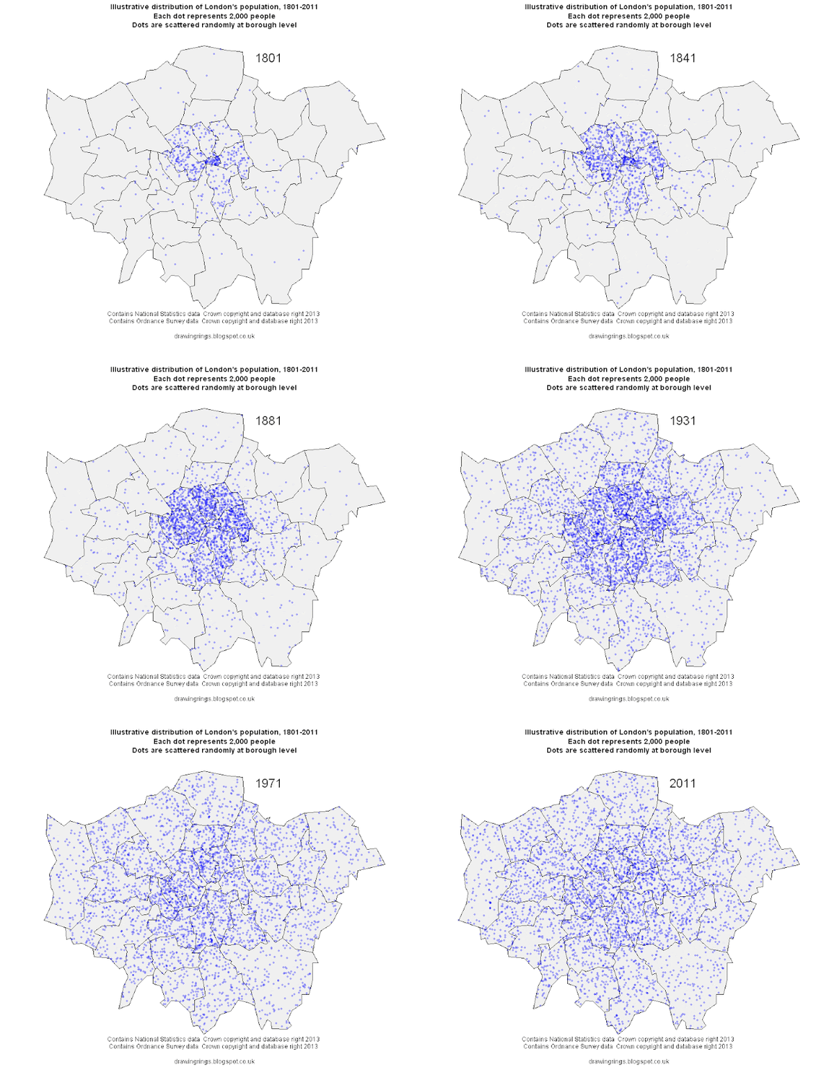
Over the last couple of hundred years London's population has grown and spread out on a vast scale. This process has involved a remarkable deconcentration of population from the centre to the suburbs: in 1801 the vast majority of its million people were crammed into a few central boroughs, with the square mile of the City of London holding 129,000 people. The population of the city grew by more than 5 million over the next century with the vast majority of that growth in the inner suburbs opened up by public transport. Over the course of the 20th century suburbanisation accelerated with the advent of the car, only for population growth to pick up again in the centre in the last few decades.

Summing up all this change in a single graphic is quite a challenge, so instead I've made this simple animated map, illustrating the changes in population using a dot-density approach where every dot represents 2,000 people. The dots are randomly distributed at borough level at the point of each Census starting in 1801 and ending in 2011, so they are not meant to represent the exact locations of individual settlements.


The maps were made in R using data from the Census (downloaded from the London Datastore and updated with 2011 data) and boundaries from the Ordnance Survey. The animation was done in UnFREEz as I couldn't get the native animation in R to work.

Sunday, 17 February 2013

What the congestion charge did

The London congestion charge was ten years old this week, which provoked a bit of discussion about it, most notable for the absence of anyone seriously calling for it to be abolished. As Adam Bienkov points out, its introduction in 2003 was by contrast preceded by an avalanche of criticism and predictions of doom, much of it motivated more by political grievance than by evidence or principle.

I think the best way to get a sense of the C-charge's impact is to look at Transport for London's data (here, under 'Central London Peak Count') showing how people travelled into central London during the weekday morning rush-hour between 1978 and 2011. The chart below shows the trend for people arriving by car or motorcycle only (for some reason TfL don't separate the two out).

The number of people entering central London by car (and motorbike) has clearly been trending downwards since the early 1980s, but just as clearly there was a very big drop in the early 2000s. What's really interesting is that although there was a big dros (of about 20,000) in 2003, the first year of the C-charge, that was preceded by two years of almost equally big drops in 2001 and 2002. I don't know very much about what transport policy was like back then but given that the same TfL data shows a concurrent spike upwards in bus ridership it does look rather like a generalised 'Livingstone effect' rather than something limited to the congestion charge alone, though obviously that was a very important part of it.

More recently the decline in car traffic has slowed a bit and in 2011 there was even a small increase, though hardly a noteworthy one. And if anyone is dissatisfied with current congestion levels in London, as for example the AA seem to be, the obvious answer is to campaign vigorously for an increase in the charge.

Sunday, 10 February 2013

A couple of maps showing where in London cycling commuting did and didn't grow between 2001 and 2011

A couple of weeks ago I posted a map showing the mix of commuting modes by ward in London from the 2011 Census, and this week I'd like to focus on the change in cycling levels since 2001. The maps below (click here and here for PDF versions) show the change in cycling, again at ward level, first the change in the number of people cycling to work in each ward and then the change in cycling's share of all commuting. I've included both because the numerical increase is interesting but can be distorted by differences in population growth.


In both maps the yellow areas represent areas of decline, the greens no change or moderate growth, and the blues higher rates of growth.

Growth in cycling commuting is concentrated in inner London and the South West, with the greatest increase in both proportional and absolute terms in Hackney. A couple of other patterns jump out: the rich boroughs of Westminster and Kensington and Chelsea are exceptions to the inner London rule, showing very little growth in cycling over the last decade, probably due to a combination of car-friendly policies and demographic factors. Newham also stands out as showing very little growth, suggesting that the river Lee or rather its crossings may be quite a significant barrier, hopefully something the new superhighway will address. South of the river there look to be pockets of high growth, in numerical terms at least, along the routes of Cycle Superhighways 7 and 8 and in a few other areas.

But while most of inner London saw pretty good growth in cycling over the decade, Hackney is clearly the star of the show. In 2001 4,940 people in Hackney said they cycled to work. By 2011 that had more than trebled to 17,312. Hackney's workforce grew at the same time, but there was a big increase in cycling's commuting mode share too, from 6.8% in 2001 to 15.4% in 2011 (in both cases excluding those working from home). In five wards cycling's mode share grew by more than ten percentage points. As Cyclists in the City pointed out, more people commute by bike in Hackney than by car or van.

There's an interesting debate to be had about whether the Hackney trend is due to demographics (an influx of young carless people), the emergence of a fairly localised pro-cycling sub-culture, or Hackney council's approach to road safety. Danny says here it's about policies and I've no doubt they're an important factor, but in my admittedly partial experience cycling in Hackney is no better than in Islington so I suspect demographics and culture have played a role too. We may know a bit more when more detailed Census data on who is cycling where comes out later in the year.

Saturday, 9 February 2013

Dangerous driving and London's draft policing plan

The Mayor's Office for Policing and Crime (MOPAC) are currently consulting on a draft Police and Crime plan for London, to cover the period 2013-17. You can read the draft here and there's a short survey about it here. The London Assembly are carrying out a review into the draft plan too, which you can read about here. The MOPAC consultation runs until 6 March while you have until 15 February if you want to tell the Assembly your views.

The top priority in the draft plan is to:
Hold the Metropolitan Police to account for delivering the Mayor’s goal of driving down the key crimes of burglary, vandalism, theft of, and theft from motor vehicles, violence with injury, robbery and theft from the person by a total of 20%.
That list of key crimes notably excludes any mention of dangerous driving, as does the document as a whole. This is despite concerns over dangerous driving and road safety featuring prominently in previous police consultations:
  • The 2010/11 Metropolitan Police Service annual report said that  "Road safety has featured consistently in the top five public priorities for policing, with speeding and dangerous driving major concerns".
  • TfL's draft road safety plan said "The Metropolitan Police Authority's 'Have Your Say on Policing in London' consultation, which ran between June and November 2010, show that traffic and road related issues are the top priority for those who took part. Particular concerns identified in the consultation focus on road safety issues."
If anyone thinks London's policing plan should include something about improving road safety and tackling dangerous driving, then please do respond to the consultation (and to the Assembly review, while you're at it), saying so.

Thursday, 31 January 2013

The colour of London's commute

Today saw the release of detailed Census data on, among other things, the mode of transport those in work use to get to work. One interesting aspect of this is the rising level of cycling in London, as described here by Cyclists in the City. I'll probably be looking at that later in the week, but first here is a map which attempts to summarise the transport mix across all of London in a single image.

(Click to embiggen, and higher-quality PDF here)

What the map shows is the mix of transport to work of residents living in each part of London*, using ONS data at Middle Super Output Area (MSOA) level. Each MSOA is given an RGB colour determined by the modal share, with red colours representing travel by car, taxi or motorbike, blue travel by public transport and green cycling or walking.

The result is a fairly simple pattern, with motor vehicles predominating on London's fringes, public transport in the inner suburbs and cycling and walking in the very centre. Those tendrils of blue reaching out presumably represent major public transport links.

A few details about the mapping technique for anyone who's interested: I was inspired to use the RGB approach by James Cheshire's map of election results and after some trial and error found a fairly simple way to do it in R which I can provide more details of to anyone who asks. The data and boundaries are both from ONS, the former downloaded from Neighbourhood Statistics. The maps exclude those people of working age who are not in work, who work from home or who use some form of transport so strange that ONS only describe it as 'other'.

* Edited this to make it clear that the map is based on place of residence, following @santacreu34's helpful comment.