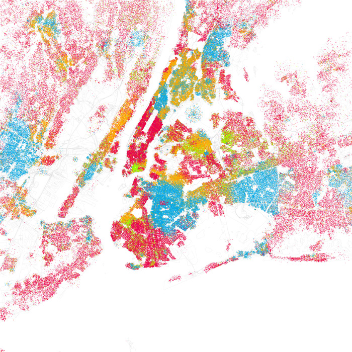
Having chatted with Eric over email about doing a similar map for London, I have produced a first stab at this below (click for a larger version).
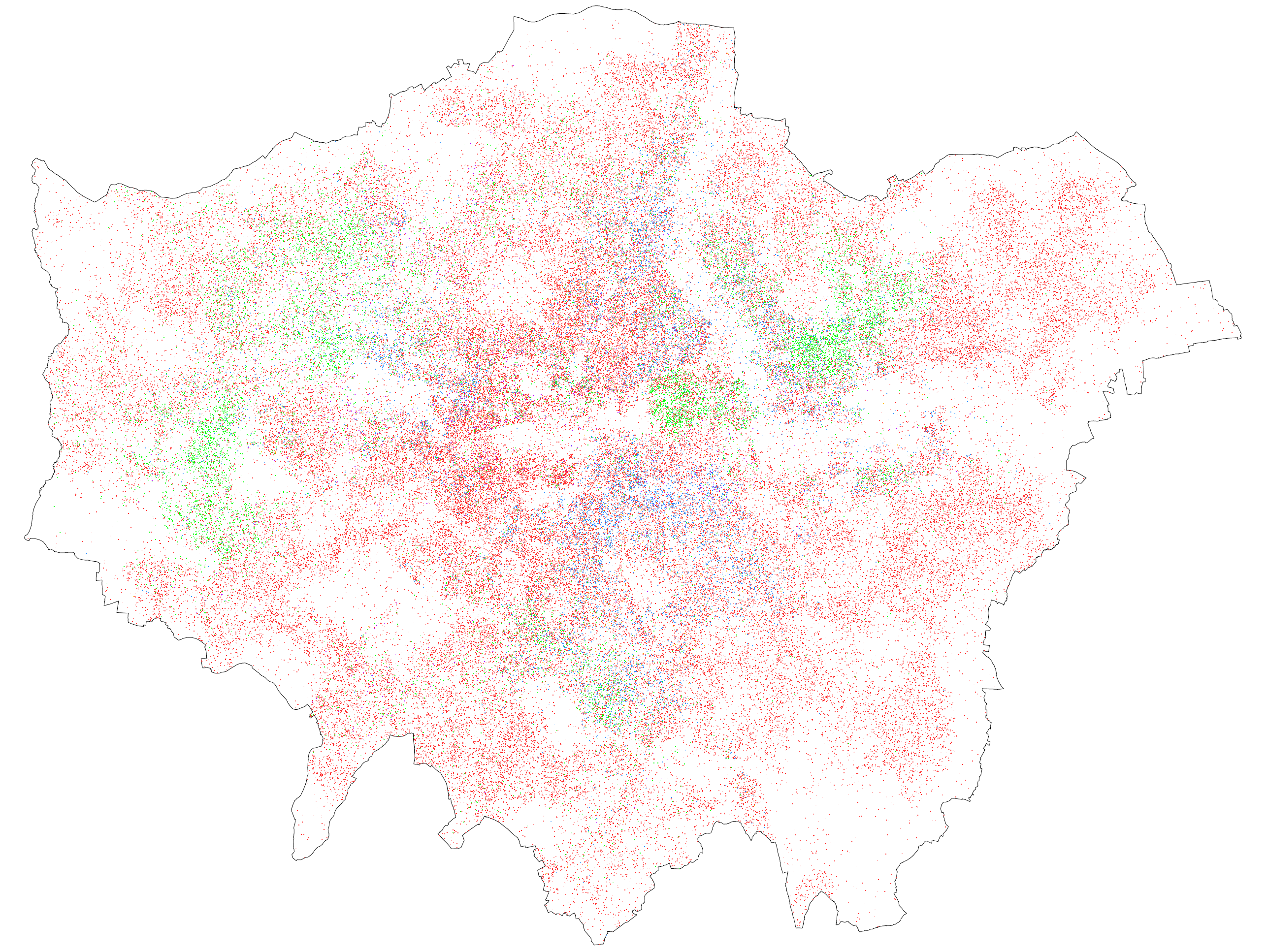
The colours aren't quite as vivid when viewed at this scale, but I'd encourage you to click on it to view at full size. I think part of the reason it's less vivid is that I use one dot for every 50 people rather than every 25, in order to avoid what I thought was too much clumping. But it might also be that there is less segregation in the first place.
It should be noted that the underlying data is a bit different. I use 2001 Census data at the Lower Super Output Area level, which is a larger geographic level than what Eric uses, so there is a bit more random scattering than in his maps. The problem, without going into too much detail, is that in the UK Census data at very small area is often slightly tweaked to remove even the slightest chance of identifying individual households, so the real number of (for example) Asian people in a neighbourhood might be slightly different from the number in the data. This problem is worse for the smallest geographic level (Output Areas) which is why I used LSOAs.
The ethnic make-up of London is also rather different from the typical US city. I used the following colour coding (the percentages indicate the share of London's population in 2001):
White - red dots - 71%
Black - blue dots - 11%
Asian - green dots - 12%
Mixed - purple dots - 3%
Chinese and other ethnic groups - orange dots - 3%
I'd be interested in anybody's comments about the map, in terms of both format and whether any conclusions can be drawn from it. At first glance it looks like London is less 'segregated' by ethnicity/race than most US cities, which would correspond with my preconceptions. Let me know what you think!
Hi
ReplyDeleteIt may be helpful to have the borough boundaries drawn onto the map; so that when we zoom in we can identify specific areas and compare if the coding is significantly good at identifying the make up of local populations; that you may get from a field study perspective, where people are observed moving around.
Keith.
Nice! It would be great to have a more complex map: One that does not picture the color of your skin but where you are born. What would interest me is more where people born in London are, where people born in the UK are, where Western European live, Where Eastern Europeans, etc. More by pocket regions. Coor of skin does not tell you whats your culture, values, background. Where you were raised... a bit more!
ReplyDeleteI wonder if you could do a new map with the recent census and see a change in pattern.
And Yes, London is looking less segregated. Maybe because the history o the city is not the same from US Cities that were modern cities built by immigrants, not a long history... !