Monday, 3 January 2011

New life for old data - Public transport trips in London, 1901 to 1928

This one's for the geeks.

I have been struck in my day job by how shallow the historical record is as presented by many online official statistical sources. Internet-era records frequently cover only the internat era, or parto f it. Meanwhile, a vast wealth of data (which often cost a vast amount of wealth to accumulate) sits locked away, on the printed pages of books on shelves in libraries that nobody visits any more.

I love finding useful old data in books nobody reads any more, and I think more of it should be shared online where others can see it. The chart below and the accompanying data are a first attempt to do. In and of itself it has no great significance. I just like the idea of this stuff being more available than it already is.

The data is from a table in a book I stumbled across in LSE library, the introductory volume of 'The New Survey of London Life and Labour', a major social research project carried out by the LSE in 1928-32 and described here. The survey data has itself been digitised recently, but the data I copied is secondary data detailing the trend in public transport trips taken in London in the first few decades of the 1900s. It covers railway, tram and 'omnibus' services (motorised buses began in 1902, and the last horse-drawn bus ran in 1911). Note that the chart shows millions of journeys
(so there were just over a billion tram journeys in 1927, for example), and it excludes journeys on foot, by bike or by private car, which would all be included nowadays.


Clearly, these were years of astonishing growth in London's public transport system. There were 1.1 billion journeys made in 1902, or 166 per head of population, but by 1928 there were 3.9 billion journeys, or 496 per capita, i.e. a tripling in the daily rate of public transport trips in 27 years. The growth of the omnibus is particularly remarkable, from 280 million trips in 1902 to 1.9 billion in 1928. In comparison (although presumably an imperfect comparison due to different methodologies), there were 3.5 million trips per day on the bus and tram in London in 2009, equivalent to about 1.3 billion in the year as a whole (see table 2.1 in this pdf).

Thursday, 30 December 2010

Many ways to go green

From yesterday's New York Times:
Massachusetts officials on Wednesday announced a plan to curb heat-trapping gases emitted by homes, cars and businesses in the state by 25 percent below 1990 levels over the next decade.

The targets set by the plan are the highest allowed under climate legislation passed by the state in 2008 and among the most stringent in the nation, placing Massachusetts in the company of California, New Mexico and other states that have taken strong action to address global warming.

Unlike California’s plan, however, which sets industry-by-industry regulations to achieve its mandated cutbacks, the Massachusetts plan relies largely on existing programs, like renewable-energy mandates, energy-efficiency standards for building construction and curbs in the electricity sector that are already in place under a multistate agreement known as the Regional Greenhouse Gas Initiative.


There's plenty to like here, in terms of improving home energy efficiency, cap-and-trade for utility firm emissions, and introducing pay-as-you-drive car insurance. But I have a nagging concern about state-level initiatives of this kind, because of the potential perverse incentive to reduce carbon emissions simply by holding down population growth. And indeed, population growth in Massachusetts, at 3.9% between 2000 and 2009, is well below the national average of 9.1% (data). On the basis of the very simple comparison of CO2 emissions in selected states in the chart below Massachusetts looks very good, but most of the difference is down to very different population growth trends.


The policies being proposed by the Massachusetts state government sound like they should reduce per capita emissions, and that's great. But a more cynical state government could take a different approach. In general, climate change mitigation is one of those things best done at as high a level as possible, precisely because of the kind of perverse incentives that could arise in state-level approaches. Besides which, we really don't need to give places like Massachusetts any extra incentive to restrict housing supply.

Thursday, 16 December 2010

New US data shows falling segregation and the suburbanisation of poverty

The US Census Bureau has released data from its American Community Survey, which over the last five years surveyed an incredible 10 million addresses resulting a dataset that is both granular and richly informative. But more importantly, the New York Times has used the data to produce some cool maps which attracted a lot of attention over the past few days. You can explore the data here http://projects.nytimes.com/census/2010/explorer: as you can see, they have adopted for their ethnicity maps a style quite similar to the Bill Rankin/Eric Fisher maps I copied for my own map of London.

While the data seems to show that the long trend of falling segregation has continued and perhaps even accelerated, there are still some remarkably segregated major cities in America, such as Detroit and Philadelphia. I was particularly struck by the ethnic distributions in Los Angeles, where the coastal areas seem to be dominated by white people, while there are huge swathes of predominantly Hispanic areas further inland. Probably not surprising to your average American, but it was news to me.


The new data also includes information on income and housing costs, and over at Discovering Urbanism they have been looking at income changes in inner cities as compared to suburbs. Do go read the full post, but the basic message is that incomes seem to be rising in city centres and falling in many suburbs. This is consistent with what has been called (using the US spelling) the 'suburbanization of poverty', and with research suggesting that people increasingly value the lifestyles offered by inner cities now that crime has fallen and deindustrialisation has cleaned up their environments. This urban renaissance is of course a double-edged sword, in that there is a risk of these newly gentrifying city centre areas becoming unaffordable for the poor and hostile to new housing supply, while poverty rises in suburbs arguably less well-equipped to cope with it.

Wednesday, 8 December 2010

People think cycling is dangerous

The UK Department for Transport have published the results of a very large and detailed survey into people's attitudes towards climate change and transport choices. There is a vast amount of information in the report and accompanying tables but I have just picked out some of the more interesting findings (for me anyway) on attitudes to cycling, particularly in London:

  • 60% of people who can ride a bike think the roads are too dangerous, including 71% of women and 66% of Londoners.

  • 63% of Londoners who can ride a bike would cycle more if there were dedicated cycle paths.

  • 90% of Londoners say cycling is the least safe form of transport.

  • 33% of Londoners don't cycle because they think there is too much traffic or the roads are too dangerous, compared to 22% in UK as a whole.

  • 62% of UK people 'haven't really thought about' cycling to work. 24% thought about it but decided not to.

Sunday, 28 November 2010

Deaths on the road: The public health emergency of the 21st century.

Every century comes with a major public health warning about the harm that we inflict on ourselves. In Britain in the nineteenth century it was the diseases we spread by tolerating open sewers. In the twentieth century it was tobacco ... In the twenty first century it is the way we tolerate how cars are allowed to travel on our roads.


Danny Dorling has a wonderful knack for encapsulating issues of inequality and social justice. The quote above is from his recent lecture entitled 'Roads, Casualties and public health: The open sewers of the 21st Century?'. You can see the slides and hear the recording here.

Saturday, 27 November 2010

Redistribution and urban inequality

Matthew Kahn's blog on environmental and urban economics is well worth your time, and I really enjoyed this analysis of Joel Kotkin's recent piece on 'middle-class' cities. Read the whole thing, but I just wanted to pick up on one part of it, where Kahn writes:
Big cities such as NYC have been generous to their urban poor and to balance the budget taxes do need to rise. In the "efficient cities" that Kotkin celebrates such as

"The winners included business-friendly Texas cities and other Southern locales like Raleigh-Durham, now the nation's fastest-growing metro area with over one million people. You can add rising heartland cities like Columbus, Indianapolis, Des Moines, Omaha, Sioux Falls, Oklahoma City and Fargo."

How do they treat their poor? There is a welfare magnets effect here. Cities such as San Francisco end up with more poor people and more taxes because they are "nice" to the poor. Non-liberal cities are rewarded for being not nice in terms of redistribution. While Kotkin would call that "efficient", there are other words for that such as "cheap" and "nasty".

Consider the dynamic at work in the 'liberal' cities Kahn describes*. City councils know that there are poor people out there they can choose to help or not. There are economic costs associated with pro-poor policies, in terms of some mix of higher expenditures, lower tax revenues, and distortions to the housing market (in the form of opportunity cost of land) if you directly provide 'public housing' or social housing as we call it. The net effect is to raise taxes or housing costs, which has a particularly negative impact on those middle-income households not poor enough to qualify for help. So there is a tendency for a city that wants to be pro-poor to become more unequal and push the middle-classes out.

I'm interested in the long-run impacts of this kind of process. Here's one scenario: if middle-income households are filtered out by higher taxes and housing costs, then higher income households might 'filter in'. Overall, the city grows richer, and so more costly, and so the affordability problems faced by the poor get worse. Simultaneously, the cost of providing housing support (directly or indirectly) for the poor also increases.

Where do we end up? Perhaps the presence of poor people in ever-richer cities eventually become too anomolous or 'costly' for some.I suspect that's a large part of what's happening in London now, with cuts to housing benefit and social housing provision.

*Kahn goes on to suggest that moving responsibility for redistribution to the federal level could deal with this problem, but I'm not convinced, as housing and planning policy are likely to remain both very important for policy towards 'the poor' and fundamentally locally controlled.

Tuesday, 9 November 2010

Map of London's population by ethnic group

Eric Fisher's brilliant maps of ethnic group distributions in US cities, inspired by Bill Rankin's original map of Chicago, have rightly attracted lots of praise (see here and here). Eric's map of New York is shown below. Using 2000 Census data on the resident population, each dot represents 25 people with the different races colour-coded - White is pink; Black is blue; Hispanic is orange, and Asian is green.


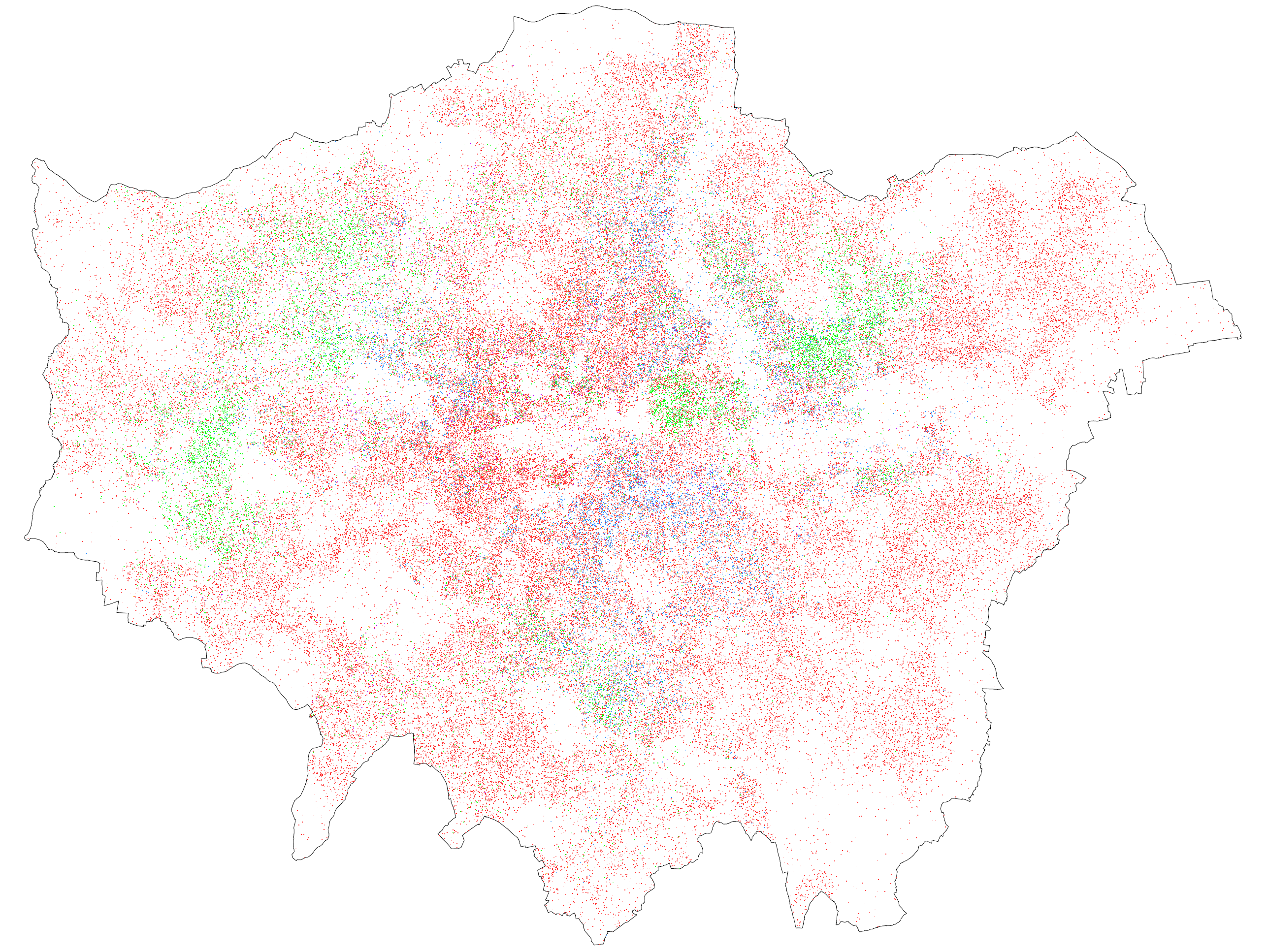
Having chatted with Eric over email about doing a similar map for London, I have produced a first stab at this below (click for a larger version).


The colours aren't quite as vivid when viewed at this scale, but I'd encourage you to click on it to view at full size. I think part of the reason it's less vivid is that I use one dot for every 50 people rather than every 25, in order to avoid what I thought was too much clumping. But it might also be that there is less segregation in the first place.

It should be noted that the underlying data is a bit different. I use 2001 Census data at the Lower Super Output Area level, which is a larger geographic level than what Eric uses, so there is a bit more random scattering than in his maps. The problem, without going into too much detail, is that in the UK Census data at very small area is often slightly tweaked to remove even the slightest chance of identifying individual households, so the real number of (for example) Asian people in a neighbourhood might be slightly different from the number in the data. This problem is worse for the smallest geographic level (Output Areas) which is why I used LSOAs.

The ethnic make-up of London is also rather different from the typical US city. I used the following colour coding (the percentages indicate the share of London's population in 2001):
White - red dots - 71%
Black - blue dots - 11%
Asian - green dots - 12%
Mixed - purple dots - 3%
Chinese and other ethnic groups - orange dots - 3%

I'd be interested in anybody's comments about the map, in terms of both format and whether any conclusions can be drawn from it. At first glance it looks like London is less 'segregated' by ethnicity/race than most US cities, which would correspond with my preconceptions. Let me know what you think!

Thursday, 4 November 2010

Housing in London 2010

In my day-job at the Greater London Authority, I have just completed the 2010 edition of Housing in London, which is our annual housing statistical digest and the evidence base for the Mayor's London Housing Strategy. You can get it here (warning, 10mb pdf). A few things stood out for me this year (note, these figures are copyright GLA and Ordnance Survey for map boundaries - see Housing in London for full details):


Going back to old Greater London Council records I was able to extend our house building trend back to 1961. The data is split by tenure, with council housing on top, housing association supply in the middle and market housing on the bottom. Obviously the big change here is the end of the huge council house building program which dominated supply into the 1970s.


Also from old GLC documents (this one a Greater London Development Plan 'Report of Studies' from 1969) comes this wonderful map showing the growth of London between the 1850s and 1950s, with lighter areas developed earlier. This was originally painstakingly constructed from a series of Ordnance Survey Maps. I'd love to update it sometime.


The pattern of much more recent housing supply is shown here, based on data from the London Development Database which I have aggregated on a 1km square grid. LDD data is incredibly detailed and I am currently working on a long-running paper trying to summarise some of the more interesting patterns.


Changing tack, this chart shows per capita carbon emissions from housing (as opposed to from transport, industry etc) on a regional basis, analysed from DECC data. The chart cheats slightly by shortening the Y axis but even if we hadn't London still really stands out from the rest of the country.


Finally, this chart attempted to summarise the impact of the government's proposed cuts to Local Housing Allowance (housing benefit in the private sector) on the English regions. More households are affected in London than anywhere else, and much more of them are hit hard, to the tune of £20 or more a week. Anyone who has been following the news will know that these proposed changes are causing quite the political storm at the moment.

More bike hire comparisons

Well, no sooner had I posted about Oliver O'Brien's work comparing bike hire schemes around the world than JC Deceaux wrote and asked him to stop scraping the data he used for the schemes in Paris, Dublin and several other sites. Happily, he could still use the historic data to put together this fascinating presentation going into a lot more comparative detail:


The Dublin scheme comes out as amazingly (to me, anyway) popular, and interestingly it shows three rather than two peaks in usage, with a lot of people apparently using them around lunchtime as well as in morning and evening rush hours (see slide 23).

Wednesday, 3 November 2010

Comparing house price bubbles in Ireland, Northern Ireland and England

There is a certain amount of disagreement over whether we have really had a proper house price 'bubble' in England, given that you would have expected a good deal of house price inflation just from the fairly large income gains in the decade 1998 to 2008 and the fairly constrained supply in many high demand areas in the South.

But there's no disagreement at all that we saw a very large bubble in Northern Ireland, which has burst fairly spectacularly in the last couple of years. Below is a chart of simple average house prices in England and Northern Ireland between 1990 and 2009 (unadjusted for inflation). While average house prices in Northern Ireland were half those in England in 1990, they rocketed in 2006 and by 2007 they were more or less equal, only to crash in 2008 and 2009.


Similarly, the Republic of Ireland is considered to have had a bubble which also burst with a vengeance. So I wondered whether the path of Northern Irish house prices was more similar to the Republic, with which it shares a border, or to England, with which it shares a regulatory framework and macroeconomic policy.

I got Irish house price data from the Department of Environment and Northern Irish and English house prices from CLG's table 505. I used annual data from 1990 onwards, and converted from nominal to real prices using the Irish and UK CPIs (there's a separate and interesting question about whether general inflation in Northern Ireland tracks inflation in the Republic more closely than inflation in Britain, but I'm not qualified to answer that one), and I rebased each trend to 100 to allow for easier comparison. The results are below:


I don't know if this actually tells us much! The Republic's house price boom seems to have started earliest, and Northern Ireland's continued on even after the bust down south. If anything I think it reinforces the idea of the dizzying rise in prices in Northern Ireland as a pure bubble, mostly unaffected by outside forces.