Showing posts with label maps. Show all posts

Monday, 4 March 2013

Mapping cyclist casualty concentrations in London

I've produced some maps of London cycling casualties on this blog before but it's hard to come up with an image that manages to capture both the scale and the spatial specificity of the issue. It matters where cycling casualties happen and it also matters how many there are in a particular area, but at the London-wide level there are so many that the most straightforward visualisation techniques just aren't adequate, even before you start trying to understand the underlying patterns of exposure and causation.

Here, for example, is a simple map showing one dot for every recorded cycling casualty in London over the five years to 2011 (the most recent year available). It includes fatal, serious and slight casualties, with the latter category by far the largest.
This map does tell us some useful things: cycling casualties are heavily concentrated in central London, and judging by the linear patterns seem to be common on major roads too. But there are so many casualties in the centre that the image becomes overwhelmed and you lose a sense of either scale or space. Some kind of aggregation would help.

Following the steps outlined on the Mapbox blog here, I generated a 'heatmap' of cycling casualties in Quantum GIS. A heatmap is a technique that uses spatial interpolation to predict the number of events (in this case, cycling casualties) in a small part of an area based on the actual number observed in or close to that area. It smooths out the pattern a bit and highlights with variations of colour the locations with the greatest concentrations.

If anything, this shows even more clearly how many casualties there are on London's major roads (including many of the ancient Roman routes shown recently on the Mapping London blog). I thought it could do with a bit more clarity, so, again following the Mapbox tutorial, I added some definition using contour lines, and a legend.  Note that the heatmap model 'predicts' 140 casualties in the deepest red cells and zero in the deep blue squares that cover most of the suburbs.


Maybe the contours look a bit messy at the London-wide scale but when you zoom into the city centre I think they help, partly by overcoming the blockiness of the heatmap results. In the map below I've labelled the areas in central London with the greatest concentrations of cycling casualties in the last five years. As you can see, the Elephant and Castle area is pretty clearly the worst in terms of the number of casualties, while there is a cluster of areas just north of the river also focused on major junctions.


Finally, here's a version with the street network showing underneath.

Tuesday, 19 February 2013

Animating London's population change 1801-2011

Over the last couple of hundred years London's population has grown and spread out on a vast scale. This process has involved a remarkable deconcentration of population from the centre to the suburbs: in 1801 the vast majority of its million people were crammed into a few central boroughs, with the square mile of the City of London holding 129,000 people. The population of the city grew by more than 5 million over the next century with the vast majority of that growth in the inner suburbs opened up by public transport. Over the course of the 20th century suburbanisation accelerated with the advent of the car, only for population growth to pick up again in the centre in the last few decades.

Summing up all this change in a single graphic is quite a challenge, so instead I've made this simple animated map, illustrating the changes in population using a dot-density approach where every dot represents 2,000 people. The dots are randomly distributed at borough level at the point of each Census starting in 1801 and ending in 2011, so they are not meant to represent the exact locations of individual settlements.


The maps were made in R using data from the Census (downloaded from the London Datastore and updated with 2011 data) and boundaries from the Ordnance Survey. The animation was done in UnFREEz as I couldn't get the native animation in R to work.

Sunday, 10 February 2013

A couple of maps showing where in London cycling commuting did and didn't grow between 2001 and 2011

A couple of weeks ago I posted a map showing the mix of commuting modes by ward in London from the 2011 Census, and this week I'd like to focus on the change in cycling levels since 2001. The maps below (click here and here for PDF versions) show the change in cycling, again at ward level, first the change in the number of people cycling to work in each ward and then the change in cycling's share of all commuting. I've included both because the numerical increase is interesting but can be distorted by differences in population growth.


In both maps the yellow areas represent areas of decline, the greens no change or moderate growth, and the blues higher rates of growth.

Growth in cycling commuting is concentrated in inner London and the South West, with the greatest increase in both proportional and absolute terms in Hackney. A couple of other patterns jump out: the rich boroughs of Westminster and Kensington and Chelsea are exceptions to the inner London rule, showing very little growth in cycling over the last decade, probably due to a combination of car-friendly policies and demographic factors. Newham also stands out as showing very little growth, suggesting that the river Lee or rather its crossings may be quite a significant barrier, hopefully something the new superhighway will address. South of the river there look to be pockets of high growth, in numerical terms at least, along the routes of Cycle Superhighways 7 and 8 and in a few other areas.

But while most of inner London saw pretty good growth in cycling over the decade, Hackney is clearly the star of the show. In 2001 4,940 people in Hackney said they cycled to work. By 2011 that had more than trebled to 17,312. Hackney's workforce grew at the same time, but there was a big increase in cycling's commuting mode share too, from 6.8% in 2001 to 15.4% in 2011 (in both cases excluding those working from home). In five wards cycling's mode share grew by more than ten percentage points. As Cyclists in the City pointed out, more people commute by bike in Hackney than by car or van.

There's an interesting debate to be had about whether the Hackney trend is due to demographics (an influx of young carless people), the emergence of a fairly localised pro-cycling sub-culture, or Hackney council's approach to road safety. Danny says here it's about policies and I've no doubt they're an important factor, but in my admittedly partial experience cycling in Hackney is no better than in Islington so I suspect demographics and culture have played a role too. We may know a bit more when more detailed Census data on who is cycling where comes out later in the year.

Thursday, 31 January 2013

The colour of London's commute

Today saw the release of detailed Census data on, among other things, the mode of transport those in work use to get to work. One interesting aspect of this is the rising level of cycling in London, as described here by Cyclists in the City. I'll probably be looking at that later in the week, but first here is a map which attempts to summarise the transport mix across all of London in a single image.

(Click to embiggen, and higher-quality PDF here)

What the map shows is the mix of transport to work of residents living in each part of London*, using ONS data at Middle Super Output Area (MSOA) level. Each MSOA is given an RGB colour determined by the modal share, with red colours representing travel by car, taxi or motorbike, blue travel by public transport and green cycling or walking.

The result is a fairly simple pattern, with motor vehicles predominating on London's fringes, public transport in the inner suburbs and cycling and walking in the very centre. Those tendrils of blue reaching out presumably represent major public transport links.

A few details about the mapping technique for anyone who's interested: I was inspired to use the RGB approach by James Cheshire's map of election results and after some trial and error found a fairly simple way to do it in R which I can provide more details of to anyone who asks. The data and boundaries are both from ONS, the former downloaded from Neighbourhood Statistics. The maps exclude those people of working age who are not in work, who work from home or who use some form of transport so strange that ONS only describe it as 'other'.

* Edited this to make it clear that the map is based on place of residence, following @santacreu34's helpful comment.

Wednesday, 23 January 2013

A better map of population density


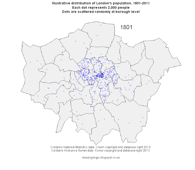
If you want to produce a map of population density the usual way to go about it is to get some Census data on density in different zones (wards, Census tracts, etc) and plot it like the map below, which shows 2011 population density in London at Middle Super Output Area (MSOA) level (darker colours represent higher density).

This approach has the virtues of being quick and a fairly standard approach, but there are serious drawbacks too. The most serious one is that this map doesn't really show you the distribution of population, because it hides the fact that across large swathes of London there are no people whatsoever. Much of London's area comprises water (only partially represented in the map above in the shape of the Thames), parkland, transport, industrial or commercial property, or some other non-residential use.

Not only do choropleth maps of this kind not show these variations in land use, but by analogy the calculation of population density across the whole area of each zone will greatly understate the 'real' density of population in zones with little residential land. Look at the very centre of the map, for example. That white blob is the City of London, and this map is telling us that it has very low population density, similar to London's semi-rural outskirts. In the sense of 'population per hectare of all land', that's true, because most of the City comprises commercial property with nobody living there. But there are some residential areas in the City and in these areas people live at fairly high densities. So in terms of 'population per hectare of residential land' the map is quite misleading.

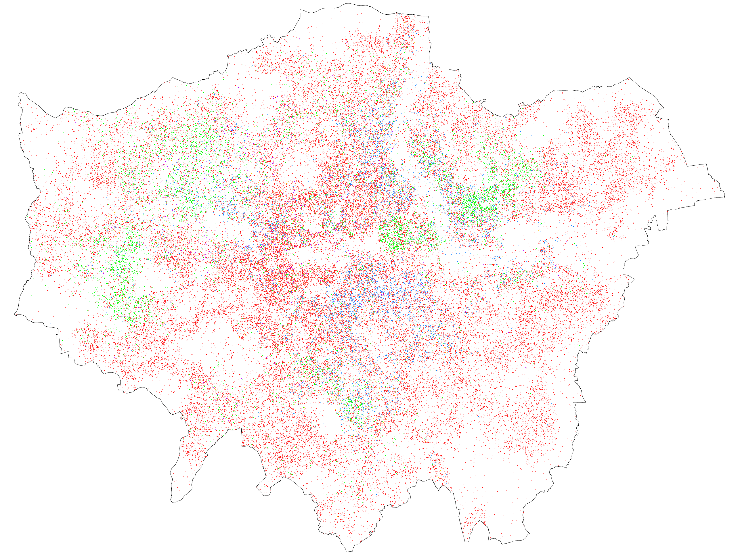
We may get a more realistic picture from a dasymetric map. This type of map combines the same kind of population data with separate data on land use, so that only the relevant areas are highlighted. For our purposes we are interested in residential land, and for that I went to the European Environment Agency's Urban Atlas maps of urban land use based on 2006 satellite data. Using R I extracted from the London map the area covered by continuous or discontinuous 'urban fabric' and also any construction sites, as most of these will be for housing. While 'urban fabric' sounds a bit general there are categories for industrial, commercial, transport, water, green, forest, leisure and other land uses so I was fairly confident that it represented residential land reasonably accurately.

Using QGIS I joined this residential land layer to the same data on population at MSOA level from the Census, recalculated population density in each MSOA on the basis of the residential land only, linked the results back onto the residential layer, and mapped it:


Click on the image for a bigger version (or find the full size 7mb behemoth here).

What we end up with is, I think, a much better map of London's population density, because it shows only the residential areas (or a close approximation) and it doesn't artificially reduce density in mostly non-residential areas like the City or indeed Bromley or neighbourhoods bordering the Lea valley.

Using this approach also changes the ranking of boroughs in terms of population density. Measured in gross terms (that is, across all land), Islington had the highest population density of any London borough in 2011 at 139 people per hectare. But looking only at residential land Islington's net population density was 181 people per hectare - higher, but not nearly as high as Tower Hamlets at 256. And this makes sense - Tower Hamlets has large areas of non-residential land (much of Canary Wharf, for example), but what residential land it does have tends to be pretty densely occupied.

I should say that this map is far from a perfect representation of reality. It has a number of flaws, such as the combination of land use data from 2006 with population data from 2011, so that it undoubtedly misses out some residential areas created in the interim. It divides the entire range of population densities into only four categories which are then treated as internally identical. And similarly, like all spatially aggregated data it hides variation within each zone, in this case MSOAs. I could have used the smaller Output Area geography, but it would have taken more time and more computing power than I wanted.

Update, 1 Feb: Here's a scrollable, zoomable version of the full-size map for you to explore:

Saturday, 24 November 2012

Map of 2001-2011 population change in London

Update: Those intelligent people in the Intelligence team at the Greater London Authority have now made a better map of population change between 2001 and 2011, which I think you should look at rather than mine (there's more GLA analysis of the Census here). 

The GLA map is better because (a) it uses ward boundaries, which unlike the statistical boundaries I used have not changed over time and therefore offer a like-for-like comparison; (b) it compares Census 2011 population to the 2001 mid-year population, which the GLA thinks is a more reliable figure than the 2001 Census figure, and (c) it's interactive! So I've put my map below the fold here, just for reference.

Monday, 18 July 2011

See something or say something - Eric Fischer's flickr/Twitter maps

See something or say something: London

I was going to write up some thoughts on what we can learn about cities from Eric Fischer's beautiful new maps of tweets and flickr photos (London above), but this interview with Eric pretty much covers it. I would just add that 'flickr density' might be a useful proxy for amenity value in economic or geographic analysis.

You should also go enjoy the full set of maps here. The man's a genius.

Monday, 14 February 2011

London ethnicity map - Now with bigger blobs

I've been told that the dot-map of London ethnicity is a bit faint, so here's a version with bigger dots! Click for full size.

The red dots represent white people, the blue dots black people, the green represent the (south) Asian categories, and there are a much smaller number of purple ones in there that represent mixed-ethnicity or 'other', such as Chinese.

Tuesday, 9 November 2010

Map of London's population by ethnic group

Eric Fisher's brilliant maps of ethnic group distributions in US cities, inspired by Bill Rankin's original map of Chicago, have rightly attracted lots of praise (see here and here). Eric's map of New York is shown below. Using 2000 Census data on the resident population, each dot represents 25 people with the different races colour-coded - White is pink; Black is blue; Hispanic is orange, and Asian is green.


Having chatted with Eric over email about doing a similar map for London, I have produced a first stab at this below (click for a larger version).


The colours aren't quite as vivid when viewed at this scale, but I'd encourage you to click on it to view at full size. I think part of the reason it's less vivid is that I use one dot for every 50 people rather than every 25, in order to avoid what I thought was too much clumping. But it might also be that there is less segregation in the first place.

It should be noted that the underlying data is a bit different. I use 2001 Census data at the Lower Super Output Area level, which is a larger geographic level than what Eric uses, so there is a bit more random scattering than in his maps. The problem, without going into too much detail, is that in the UK Census data at very small area is often slightly tweaked to remove even the slightest chance of identifying individual households, so the real number of (for example) Asian people in a neighbourhood might be slightly different from the number in the data. This problem is worse for the smallest geographic level (Output Areas) which is why I used LSOAs.

The ethnic make-up of London is also rather different from the typical US city. I used the following colour coding (the percentages indicate the share of London's population in 2001):
White - red dots - 71%
Black - blue dots - 11%
Asian - green dots - 12%
Mixed - purple dots - 3%
Chinese and other ethnic groups - orange dots - 3%

I'd be interested in anybody's comments about the map, in terms of both format and whether any conclusions can be drawn from it. At first glance it looks like London is less 'segregated' by ethnicity/race than most US cities, which would correspond with my preconceptions. Let me know what you think!