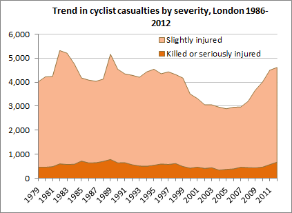
Last Friday Transport for London released statistics on London's recorded road casualties in 2012, along with (for the first time) some useful raw data - see under 'Data extracts' here. I've used the new figures to update some long-term trends in cycling casualties in London. Unfortunately they don't make for cheerful reading.
The first chart shows the trend in total recorded cycling casualties, split into slightly injured and killed or seriously injured ('KSI', in the rather inadequate jargon). As you can see, total casualties peaked in the early and late 1980s, fell fairly steadily in the early years of this century but rose again from about 2007, reaching just over 4,600 in 2012.
The large number of slight casualties hides the trend in fatl or serious casualties so the next chart isolates those. It show a slightly different trend, peaking in 1989 at almost 800 a year and with a sharp increase in the last few years to 671 in 2012.
These trends are pretty grim for cyclists, which as the chart below shows have comprised a seemingly ever-increasing share of London's fatal or serious road casualties over the last decade, reaching a fairly shocking 22% in 2012. Maybe instead of asking that cyclists get a share of investment equal to their mode share (around 2%) we should be demanding they get the same as their share of casualties?
Finally, let's have a look at cycling in the City of London, the tiny square mile at the heart of London which so many of us have to cycle through even if the people who run the place would rather we didn't. The first chart here shows a rising trend in total cycling casualties in the City since 1986.
And the second chart shows the trend in fatal or serious cycling casualties.
It should be fairly clear that the City has a big problem with cycling safety. Bear in mind that its Local Implementation Plan sets a target to reduce the number of fatal or serious casualties (of any type) to a yearly average of 39 by 2013 (4.54 here). But instead the trend is going in the opposite direction, with 49 killed or seriously injured in 2011 and 58 in 2012. As the chart above shows, cycling accounts for much of this increase, so maybe the City needs to radically change its approach to cycling provision if it's to have any chance of meeting its own targets.
One of the questions people reasonably ask when they see these kind of trends is whether casualties are rising faster than the number of people cycling, which we know has grown a lot in recent years. TfL point out that cycling on London's main road network has increased by 60% since 2005/06, but that overstates the growth in cycling trips around London as a whole, which as of 2011 had increased by only around 16% over the 2005-09 average compared to a 36% increase in fatal or serious casualties (compare table 3.5 here and table 2 here). So it's safe to say that the cycling casualty rate has worsened over the last few years, even if it's better than it was in the 1980s.


Looking at those graphs, there's a peak for 1989 in all of them (albeit sometimes a small one) – I wonder what happened in 1989 that made it so dangerous for cycling?
ReplyDeleteSecondly – does this put paid to the "safety in numbers" theory that cycling gets safer as the number of people doing it increase?
I guess it puts paid to the extreme version of the safety in numbers theory, i.e. the idea that it applies strongly everywhere and at all times. I still think a more contingent version probably has something to it, i.e. having more cyclists around probably does make drivers take more notice of them, but this effect can be more than offset by other things, e.g. existing facilities becoming overcrowded. So you certainly can't just sit back and wait for the safety to happen.
ReplyDelete