Tuesday, 19 February 2013

Animating London's population change 1801-2011

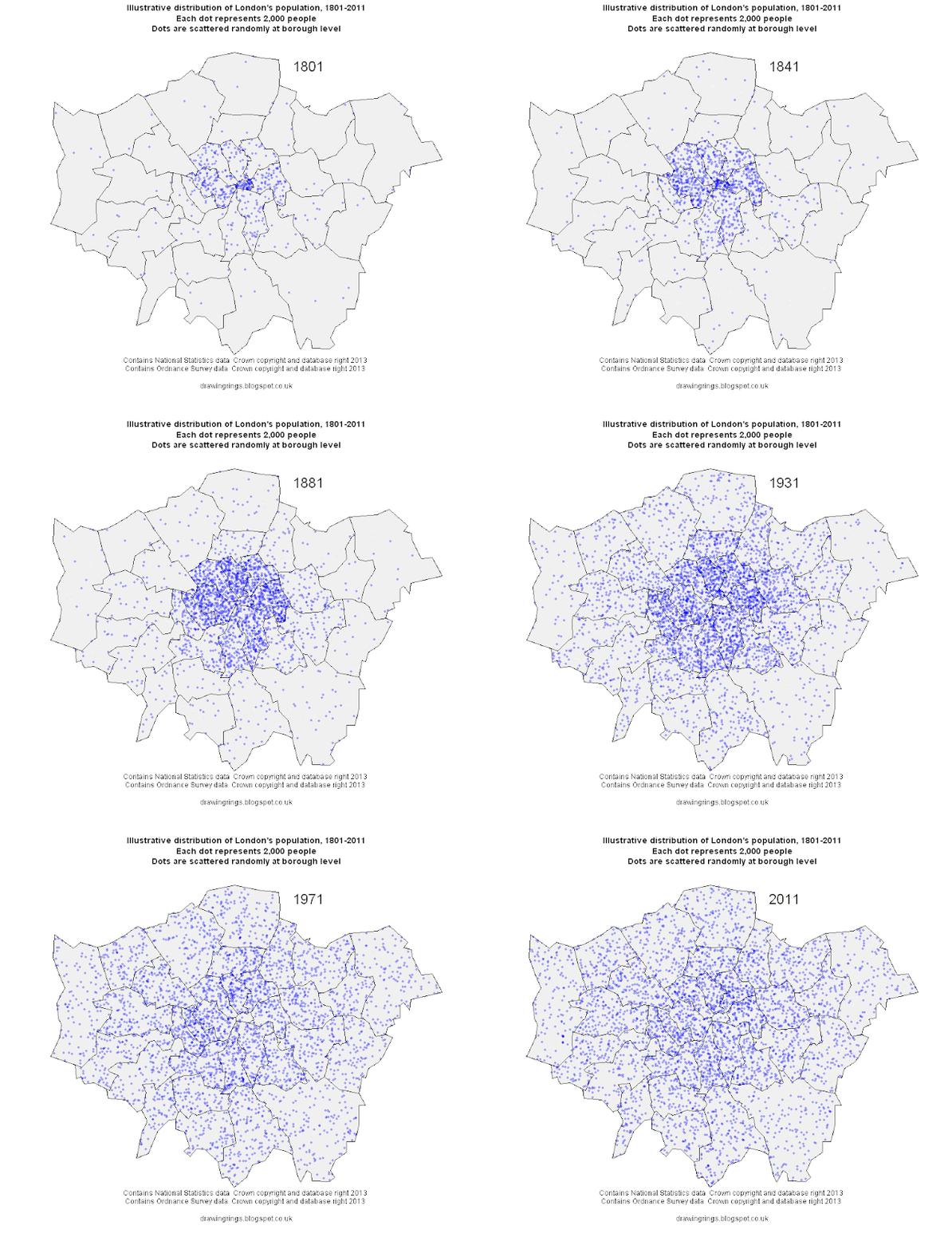
Over the last couple of hundred years London's population has grown and spread out on a vast scale. This process has involved a remarkable deconcentration of population from the centre to the suburbs: in 1801 the vast majority of its million people were crammed into a few central boroughs, with the square mile of the City of London holding 129,000 people. The population of the city grew by more than 5 million over the next century with the vast majority of that growth in the inner suburbs opened up by public transport. Over the course of the 20th century suburbanisation accelerated with the advent of the car, only for population growth to pick up again in the centre in the last few decades.

Summing up all this change in a single graphic is quite a challenge, so instead I've made this simple animated map, illustrating the changes in population using a dot-density approach where every dot represents 2,000 people. The dots are randomly distributed at borough level at the point of each Census starting in 1801 and ending in 2011, so they are not meant to represent the exact locations of individual settlements.


The maps were made in R using data from the Census (downloaded from the London Datastore and updated with 2011 data) and boundaries from the Ordnance Survey. The animation was done in UnFREEz as I couldn't get the native animation in R to work.

Sunday, 17 February 2013

What the congestion charge did

The London congestion charge was ten years old this week, which provoked a bit of discussion about it, most notable for the absence of anyone seriously calling for it to be abolished. As Adam Bienkov points out, its introduction in 2003 was by contrast preceded by an avalanche of criticism and predictions of doom, much of it motivated more by political grievance than by evidence or principle.

I think the best way to get a sense of the C-charge's impact is to look at Transport for London's data (here, under 'Central London Peak Count') showing how people travelled into central London during the weekday morning rush-hour between 1978 and 2011. The chart below shows the trend for people arriving by car or motorcycle only (for some reason TfL don't separate the two out).

The number of people entering central London by car (and motorbike) has clearly been trending downwards since the early 1980s, but just as clearly there was a very big drop in the early 2000s. What's really interesting is that although there was a big dros (of about 20,000) in 2003, the first year of the C-charge, that was preceded by two years of almost equally big drops in 2001 and 2002. I don't know very much about what transport policy was like back then but given that the same TfL data shows a concurrent spike upwards in bus ridership it does look rather like a generalised 'Livingstone effect' rather than something limited to the congestion charge alone, though obviously that was a very important part of it.

More recently the decline in car traffic has slowed a bit and in 2011 there was even a small increase, though hardly a noteworthy one. And if anyone is dissatisfied with current congestion levels in London, as for example the AA seem to be, the obvious answer is to campaign vigorously for an increase in the charge.

Sunday, 10 February 2013

A couple of maps showing where in London cycling commuting did and didn't grow between 2001 and 2011

A couple of weeks ago I posted a map showing the mix of commuting modes by ward in London from the 2011 Census, and this week I'd like to focus on the change in cycling levels since 2001. The maps below (click here and here for PDF versions) show the change in cycling, again at ward level, first the change in the number of people cycling to work in each ward and then the change in cycling's share of all commuting. I've included both because the numerical increase is interesting but can be distorted by differences in population growth.


In both maps the yellow areas represent areas of decline, the greens no change or moderate growth, and the blues higher rates of growth.

Growth in cycling commuting is concentrated in inner London and the South West, with the greatest increase in both proportional and absolute terms in Hackney. A couple of other patterns jump out: the rich boroughs of Westminster and Kensington and Chelsea are exceptions to the inner London rule, showing very little growth in cycling over the last decade, probably due to a combination of car-friendly policies and demographic factors. Newham also stands out as showing very little growth, suggesting that the river Lee or rather its crossings may be quite a significant barrier, hopefully something the new superhighway will address. South of the river there look to be pockets of high growth, in numerical terms at least, along the routes of Cycle Superhighways 7 and 8 and in a few other areas.

But while most of inner London saw pretty good growth in cycling over the decade, Hackney is clearly the star of the show. In 2001 4,940 people in Hackney said they cycled to work. By 2011 that had more than trebled to 17,312. Hackney's workforce grew at the same time, but there was a big increase in cycling's commuting mode share too, from 6.8% in 2001 to 15.4% in 2011 (in both cases excluding those working from home). In five wards cycling's mode share grew by more than ten percentage points. As Cyclists in the City pointed out, more people commute by bike in Hackney than by car or van.

There's an interesting debate to be had about whether the Hackney trend is due to demographics (an influx of young carless people), the emergence of a fairly localised pro-cycling sub-culture, or Hackney council's approach to road safety. Danny says here it's about policies and I've no doubt they're an important factor, but in my admittedly partial experience cycling in Hackney is no better than in Islington so I suspect demographics and culture have played a role too. We may know a bit more when more detailed Census data on who is cycling where comes out later in the year.
Saturday, 9 February 2013

Dangerous driving and London's draft policing plan

The Mayor's Office for Policing and Crime (MOPAC) are currently consulting on a draft Police and Crime plan for London, to cover the period 2013-17. You can read the draft here and there's a short survey about it here. The London Assembly are carrying out a review into the draft plan too, which you can read about here. The MOPAC consultation runs until 6 March while you have until 15 February if you want to tell the Assembly your views.

The top priority in the draft plan is to:
Hold the Metropolitan Police to account for delivering the Mayor’s goal of driving down the key crimes of burglary, vandalism, theft of, and theft from motor vehicles, violence with injury, robbery and theft from the person by a total of 20%.
That list of key crimes notably excludes any mention of dangerous driving, as does the document as a whole. This is despite concerns over dangerous driving and road safety featuring prominently in previous police consultations:
  • The 2010/11 Metropolitan Police Service annual report said that  "Road safety has featured consistently in the top five public priorities for policing, with speeding and dangerous driving major concerns".
  • TfL's draft road safety plan said "The Metropolitan Police Authority's 'Have Your Say on Policing in London' consultation, which ran between June and November 2010, show that traffic and road related issues are the top priority for those who took part. Particular concerns identified in the consultation focus on road safety issues."
If anyone thinks London's policing plan should include something about improving road safety and tackling dangerous driving, then please do respond to the consultation (and to the Assembly review, while you're at it), saying so.