Monday, 21 February 2011

Cycling in the City of London isn't getting much safer

Cyclists in the City link to a new report on road safety from the City of London, which for international readers is basically the 'Square Mile' financial district in central London. The report includes this chart showing the trend in the number of cyclists killed or seriously injured ('KSI') on the City's roads.

Looks bad! But wait, the City report says:
However the numbers of cyclists riding into the City has significantly increased, so that the actual casualty rate is falling.
Except they don't try to quantify the 'casualty rate'. So I thought I'd have a go.

Chapter 1 of the City's Draft Local Implementation Plan includes another trend chart, this one showing the number of cyclists counted crossing the City boundary on a single day in a given year [1].

To save you squinting, those numbers are:

1999 7,664
2002 9,565
2005 15,425
2007 16,030
2010 24,888

I combined the two, added a linear interpolation for missing years, and also linear trends for each time series, to get the following.


It's tempting to look at the two parallel trend lines and conclude that the relationship between cycle trips and KSI has not really changed, but that would be wrong, as the cyclist count was starting from a relatively low base so has actually increased by a higher percentage.

Another way to look at it is to isolate the years for when we have both count and KSI data, as in the table below [2]. Unfortunately there are only four of these and the most recent is 2007.

It is hard, and possibly foolhardy, to try and extrapolate a trend from so little data (but the same surely applies to the City's take on the figures). There certainly looks to have been a reduction from 1999 to 2002, but then no sign of any further fall in the five subsequent years.

This tallies somewhat with analysis carried out by Ben Lewis of TfL, who calculated cyclist accident exposure rates in Inner and Central London based on TfL counts at a large number of different sites and found a non-linear relationship between the number of cyclists at a particular location and the accident rate (see chart below).

The dashed vertical lines indicate current levels of cycling in each part of London. What the chart shows is that the accident rate is lower in Central London than in Inner London (perhaps partly due to 'safety in numbers') but is in danger of bottoming out in the absence of substantial additional safety measures.

This trend, or rather lack of trend, should be of great concern to the City. Cyclists accounted for 19 of the 46 KSIs in the City in 2009 (table 3.10 here), and in its draft LIP it has set out one target to grow the number of cyclists entering from 24,888 in 2009 to 36,300 in 2013, and another target to reduce the total number of KSIs to 37 by 2013. But if cycling does grow to 36,300 trips and the accident rate doesn't fall any further, from my table above we would expect to see 27 or so cyclists killed or seriously injured in a given year. It seems unlikely that non-cyclist KSIs (most of them pedestrians) will fall from 27 to only 10 in such a short period, in which case the KSI target won't be met.

In fact, the accident rate for either cyclists or pedestrians is going to have to fall dramatically if the City is going to meet both its target to grow cycling numbers and reduce the numbers killed or seriously injured. There is little sign in the draft LIP that the City is really considering any measures that are going to dramatically improve conditions for cyclists and pedestrians, so right now it seems extremely unlikely that it is going to achieve both of its targets. Something is going to have to give - the question is, will we see the growth in cycling tail off, or continue upwards at the expense of yet more cyclists killed or maimed on the City streets?

[1] There is frustratingly little information given about this count (Is is just cyclists entering the City, or all boundary crossings? Is the count always at the same site? Is it measured just once a year or averaged over several days?), so we just have to assume that the methodology is consistent from year to year.

[2] Note that the size of the figures in the final column isn't that meaningful, since it divides an annual figure (KSI) by a daily figure (cycle count).

Saturday, 19 February 2011

The mismeasurement of urban Egypt

The short version of this post is that despite recent reports, urbanisation in Egypt has not gone into reverse in the last 30 years. The Egyptian government systematically under-estimates both the size of and the growth in Egypt's urban population for adminstrative/political reasons. For the full story, see below the fold.

Monday, 14 February 2011

London ethnicity map - Now with bigger blobs

I've been told that the dot-map of London ethnicity is a bit faint, so here's a version with bigger dots! Click for full size.

The red dots represent white people, the blue dots black people, the green represent the (south) Asian categories, and there are a much smaller number of purple ones in there that represent mixed-ethnicity or 'other', such as Chinese.

Sunday, 13 February 2011

Big differences in attitudes to speeding by age, gender and income

The Department for Transport have published some fascinating research recently (funded by the previous government, I imagine) which has unfortunately received very little media attention, presumably because they have chosen not to highlight it themselves by spoon-feeding the media with press releases and the like. In December they released the results of a big survey into attitudes towards transport and climate change (which I picked out some cycling-related factoids from) and now we've got the results of a survey into attitudes towards road safety. I'm just going to highlight one particular aspect below, but I would encourage you to read the report and/or the accompanying tables yourself.

According to table A1.12 here, 21% of respondents think the level of police enforcement for speeding is 'too high', 45% 'about right' and 33% 'too low'. Seeing as speeding is also dangerous for drivers and pedestrians and costly for society as a whole, you might wonder why the police don't enforce the law on this more strongly. Then you look at the detailed breakdowns:

  • Men are slightly more likely to think there is too much enforcement than too little, while women are three times as likely to think there is too little. 
  • Those on low incomes (up to £15k a year) are two to three times as likely to think there is too little enforcement as too much, in contrast to those on higher incomes who are more likely to think there is too much than too little.
  • Around half of the elderly (aged 75 or over) think there is too little enforcement of the speed limit, compared to only 12% who think there is too much.
  • Drivers are almost evenly split on the issue, while three times as many non-drivers think there is too little enforcement as think there is too much. 
We shouldn't ignore the substantial fraction of people (40% to 50% in most socioeconomic groups) who think current enforcement levels are 'about right', but I think these figures should still be of concern to the police and the government. On one side you've got groups of people who have historically been fairly culturally dominant (i.e who are affluent, male, middle-aged or all three) and who by their own account are also more likely to drive (see table A1.1),  to break speed limits (table A1.36) and to break them by a lot (table A1.63). These people either think the law is either about right or too harsh. On the other side you've got groups who have often been marginalised (women, the elderly, the poor) who are much less likely to drive, who drive more safely when they do drive, and who think that current levels of enforcement are too low. In an era when the state is meant to be actively promoting 'equalities' (as well as, y'know, enforcing the law), I'd suggest that the police and the government should seriously think about whether they are striking the right balance.

Saturday, 12 February 2011

Quibbling with Ed Glaeser about housing supply in London

In the course of an interesting interview with The Atlantic on the subject of cities in general and his forthcoming book on cities in particular, Ed Glaeser says:
London has imposed a huge cost on itself by keeping its height so low — far too low relative to what an incredibly exciting, great city it is. That city could be much more affordable than it is now, and much more inclusive. It has rigidly held to its Victorian building style, particularly for residential. They have allowed some commercial high-rises to go up, which is fairly typical — usually there’s more comfort with building up in commercial zones than there is in residential sectors.
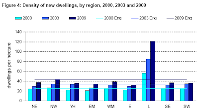
That's only partly right. While London has not been building enough homes to make housing much more affordable, a lot is being built, and at high densities. New housing supply has been running at between 25,000 and 30,000 a year since 2003 (see table 15 in this pdf), and building densities have doubled in the last decade, as the chart below shows (source). We have built quite a few high-rise residential towers in the past few years, and there are many more in the pipeline (1).

So I think it's not quite as Prof Glaeser suggests (2), in that we're not still churning out Victorian-style homes (not that Victorian terraces are particularly low-density, mind). But he may still be right that we are not building enough new housing overall, partly due to a concern with not over-densifying existing residential areas - i.e. we're not replacing our existing Victorian terraces with higher-density flats.

If you look at the borough-level supply figures you'll see that the highest supply is in areas with either a lot of ex-industrial land or a relative lack of wealthy home-owners, or both (such as Tower Hamlets). Put another way, it is a lot easier to get homes built where there are either not many neighbours or at least not many of the kind likely to make a lot of noise objecting.

This pattern is worrying for a couple of reasons. Firstly, we will presumably eventually run out of former industrial sites to convert to residential use. Secondly, if incomes keep rising in Inner London and if housing benefit changes help force renters out at the expense of affluent homeowners, we can perhaps expect objections to new housing supply to get more vociferous.

(1) I know, many of the towers at that link are commercial. But many others are at least part-residential.
(2) Note, these figure only go up to 2009. I'm currently working with colleagues in the GLA on the new Annual Monitoring Report, which will have data for 2010.