Wednesday, 28 December 2011

Contributory factors in cyclist casualties

Mark King of the Guardian writes:
DfT statistics reveal that the biggest single contributory factor in cycle deaths is the cyclist failing to look properly (25% of fatalities), followed by failing to judge the other person's path or speed (10%), the cyclist entering the road from the pavement (8%), and careless or reckless behaviour (8%).
This gives the impression that errors by cyclists themselves are the dominant factors contributing to cyclist deaths. And that would be the wrong impression, because (a) the figures quoted refer to all accidents, not just fatal ones, and (b) by definition they exclude any actions of motorists or other non-cyclists. The rest of this post goes into these reasons in more detail.

The statistics Mark King is referring to are from DfT's 2010 road casualties report here. Table RAS50005 in that report shows 'Contributory factors reported for vehicles in reported accidents' and under 'Pedal cycles' the top 'Contributory factor attributed to vehicle' is indeed 'Failed to look properly' at 25% of the total number of cases. But these figures don't mean what Mark King thinks they mean.

First of all, it should be fairly clear that this table doesn't just deal with fatal accidents. There are 11,929 incidents reported under the 'Pedal cycle' category, and I think most people know that there weren't 11,929 cycling fatalities in 2010. So that's one rather important mistake.

The second issue is more subtle but is important to understand. As the DfT report makes clear in the paragraph directly above the table in question, these figures are about the contributory factors attributed to vehicles involved in accidents, not the factors behind each accident. Put another way, the table describes what vehicles of each type did, not what caused casualties of each type. So the 168,990 figure at the end of the 'Car' column indicates the number of cars involved in reported collisions, not the number of car driver/passenger casualties (the fact that the figure is labelled as 'Number of vehicles' and not 'Number of casualties' is a clue).

So the figures quoted don't show all the factors contributing to cyclist casualties, but only what cyclists did in collisions involving cyclists, which will include a number of collisions where there were no cyclist casualties at all (e.g. involving pedestrians).

Unfortunately DfT don't seem to publish statistics showing the contributory factors to cycling casualties. Fortunately, the Transport Research Laboratory published a report in 2009 which does just this (in fact, Mark King mentions it in his article).

Briefly, the TRL report lists 430 collisions where a cyclist was killed (between 2005 and 2007), of which 354 were reported as involving a collision with another vehicle (figure 7-2). In 183 of these fatal collisions there were contributory factors attributed to cyclists, of which 31% (which equates to 57) involved the cyclist failing to look properly (table 7-4). 57 is 13% of 430, so you can probably say that cyclists failing to look properly was reported as a contributory factor in 13% of cyclist fatalities, not 25% as Mark King says. It's also worth noting that figure 7-6 shows that drivers failing to look properly was reported as a contributory factor in an almost identical number of cases (44% of the 131 cycle fatalities where a contributory factor was attributed to drivers). As the TRL report says, "attribution is split fairly equally between the cyclist and driver/rider of the motorised vehicle".

Finally, it is really important to understand that these figures are just based on what police officers subjectively reported when they were called to the scene of a collision. As the TRL report states very clearly, "this does not necessarily mean that the cyclist or other road user was in fact responsible". The media and the rest of us should bear that in mind when using these figures.

Tuesday, 15 November 2011

Some estimated cycling casualty rates for London and other cities (a work in progress)

Update! I've added figures for Helsinki (thanks Tommi) and Vienna (from here). Details are in the accompanying spreadsheet.

It would be very interesting and useful to have some statistics allowing us to compare the safety of cycling between different cities around the world, but this kind of thing is very hard to come by. As far as I can see it's nobody's job to collect statistics from cities in different countries, so at present nobody does it. In some places, individual city governments/authorities/mayoralties do collect and publish statistics, but only some of these are comparable with other cities. This post is the start of an attempt to collect together figures which we can use to compare London to other cities in terms of cycling casualty rates.

Please note, these figures are just initial estimates, cobbled together from available sources, some of which may not be correct. I would very much welcome any better information, and especially any similar information for other cities. If there's something here you think is wrong, instead of getting annoyed why not send me a correction?

The table and chart below show some summary information on distance cycled, cycle casualties, and the cycling casualty rate (per distance cycled) in Amsterdam, Copenhagen, Berlin and London (and now Helsinki and Vienna). This spreadsheet gives more detail on the sources, which where possible are official statistics but in a couple of cases (e.g. the total distance cycled in Amsterdam per day) are not.


Amsterdam 2009Copenhagen 2010Vienna 2008Berlin 2009Helsinki 2008London 2010
KM cycled per day (m km)2.21.21 -4.820.821.73
KM cycled per year (hundred millions of km)8.03 4.05 2.7617.582.986.32
KSI per year10492 71538170467
KSI per 100m km per year13232630.615774
Million km per KSI7.7 4.43.9 3.271.8 1.4


For the casualty rate I've used the number of cyclists killed or seriously injured per 100 million kilometers cycled per day in each city. I know the casualty rate per km isn't very good for comparing the relative risks of different modes of transport where the average trip length is very different, but it should be fine for comparing cycling casualty rates between cities. I guess you could also calculate a casualty rate per trip, but then you get into how to define a 'trip', which isn't as straightforward as you might think.

I should probably say that this certainly isn't an attempt to make London look like a dangerous place to cycle. While I think it could certainly improve on that score, I'm sure there are many, many cities with worse casualty rates. But most of them probably don't collect any robust, comparable statistics. There is a selection bias of sorts at work here, in that it is generally those places which have fairly strong cycling cultures which collect the best statistics on cycling.

I'd love to add some more cities, but comparable data is hard to come by. I looked around for data from Paris and found absolutely nothing, while I couldn't find any statistics on distance cycled in New York. Any help on these two or on any other cities would be really appreciated.

Another important caveat: In each case I've taken the city borders as read. Measuring the extent of a city is notoriously difficult, everyone does it a bit differently, and in most cases statistics are just based on administrative borders rather than any 'functional area'. So it maybe that with these statistics each city is defined differently, for example with some including suburbs and some not. I know that the London area used here includes a lot of suburbs, but I don't know whether the other cities do. I'd be interested to hear from anyone who does and who thinks this might significantly affect the answers.

Tuesday, 1 November 2011

Cycling trends in London since 2001

A couple of weeks ago I wrote about how cycling to work became more common in Inner London and less common in Outer London between 1971 and 2001. This provoked an excellent post on the 'cycle of decline' in Outer London from David Arditti (see also here).

Now I'm going to look at what information we have on more recent cycling trends. The results of the 2011 Census won't be out for another year or thereabouts, so instead I'm drawing on the Department for Transport's National Road Traffic Survey data, which you can access here. DfT count the average daily flow of traffic on major roads throughout the country on a yearly basis, and there's more detail on how it works here. I used some of this data for a previous post on trends in cycling at Kings Cross.

DfT's data includes traffic counts at nearly 1,900 count points on major roads in London between 1999 and 2010, with a few gaps here and there. The usual major categories of motor vehicle are counted, as are cyclists. And by averaging all the counts in a particular borough you can get an idea of the trends at borough level, with the caveat that the data doesn't cover minor roads.

The first chart below shows the trend in DfT's average daily count of cycles between 2001 and 2010 in Central London (Westminster and the City of London), the rest of Inner London and Outer London.


So what we see is an increasing divergence between the inner city and the outer suburbs over the last decade. The average cycle count increased by about three-quarters in Central London and doubled in Inner London, but rose by only about a third (122 to 159) in Outer London.

The chart below (click to embiggen) gives some borough-level data, showing the percentage change in average daily cyclists count by borough, with the Inner London boroughs in blue and the Outer London in red.

Update: I have added another chart, this time showing cycling's share of total traffic in each borough in 2001 and 2010. This shows that in the case of some boroughs (like Barnet) which have seen fairly high proportional increases the actual level of cycling (compared to overall traffic) is still quite low.


Again there's a stark contrast between Inner and Outer London boroughs, though cycling increased in nearly every borough over the period. Barnet and Greenwich saw relatively high increases in cycling for Outer London boroughs, while Westminster had a relatively low increase for a central borough (contrast with the City).

My post on Census data included a chart which identified a fairly close relationship between increases in car use and declines in cycling. The chart below plots the percentage point change in cars' share of average traffic flows versus the change in cycling's share, at borough level, and this time the relationship looks even stronger, with areas where cycling increased the most also seeing the biggest falls in car traffic (note, 'car' traffic here doesn't include goods vehicles). Those boroughs in the top left corner (with both big decreases in car traffic and big increases in cycling) are City, Lambeth, Southwark, Islington and Camden. The two Inner London boroughs where the share of car traffic has risen are Newham and Tower Hamlets.


Finally, here are a couple of charts which show the change in the share of cycling and car traffic at each count point, arranged by distance in kilometres from the centre of London (Trafalgar Square, to be exact). There's a good bit of noise at the level of individual count points, but the overall patterns are still fairly clear - the roads closest to Central London generally saw the largest increase in cycling's share of total traffic and the biggest drop in car traffic's share.


Wednesday, 19 October 2011

The urbanisation of cycling in London

I've just published a post over at LondonTransportData about what I think are some very interesting trends in the proportion of people who cycle to work in London. The data is from four successive Censuses, 1971 to 2001, and at London level it looks like this:

Not all that interesting, but go below regional level and you get this.

What we're seeing here is that whereas cycling to work was twice as common in Outer London as in Inner London in 1971, by 2001 it was the other way around. Rates of cycling to work fell for 40 years in Outer London and rose in Inner London.

Here's the pattern at borough level:

As I say on LTD, two things stand out here. First, boroughs with relatively high cycling rates in 1971 tended to see decreases over the next 30 years. Secondly, Inner London boroughs nearly all saw an increase while Outer London boroughs nearly all saw a fall. The only Inner London borough that didn’t increase its cycling rate over this period was Newham.

On the basis of this data it looks like cycling in London changed from a mostly suburban to a mostly urban phenomenon over the course of a few decades, although it's worth bearing in mind that it remained very much a minority pursuit in both areas throughout the period. It would be nice to know why this change happened, and I'd be interested to hear any theories anybody has, bearing in mind that it all happened the introduction of the congestion charge, and mostly before we had much in the way of red routes, or 20mph zones.

Here a are a few theories on what might have caused this turnaround:

Traffic: There was less motor vehicle traffic in both Inner and Outer London in 1971 than in 2001. Perhaps as a result cycling conditions in the suburbs were relatively benign, as there was more space on the roads than in the inner city. But as traffic increased, two things happened: in Inner London, rising congestion made commuting by car painfully slow, so the bike became a more attractive option for some. But in Outer London, increasing traffic just increased the collision threat faced by cyclists, and most of them stopped as a result.

The Census data provides some tentative support for this hypothesis: as the chart below shows, car commuting increased much more in Outer London over the 40 year period, and across London there was a strong negative relationship between the change in car commuting and the change in cycle commuting.


Infrastructure: Maybe it was all about changes in the provision of cycling facilities in Inner and Outer London, with cycle lanes and paths being added in Inner London and taken away in Outer. Or maybe there's a link with the first theory, in that the lack of infrastructure in Outer London didn't matter when there wasn't much traffic but became a deterrent when there was.

Labour market: Maybe it was the pattern of commuting that changed, with longer journeys less suited to the bike becoming the norm in Outer London over time. I'm sure there's data out there on trends in commute lengths, but it might be hard to disentangle cause from effect.

Of course, it could be a mix of the three, or something else altogether. But I think anyone interested in growing cycling in London needs to think about why this happened. I'd also love to hear whether there's any evidence of a similar pattern in other cities.

Monday, 17 October 2011

Cycling trends at Kings Cross

Following the tragic but sadly all too predictable death of Min Joo Lee at Kings Cross a fortnight ago, some people are talking about a charge of corporate manslaughter against TfL.

Something you sometimes hear in debates around the rising number of cycling casualties is that the number of people cycling in central London is growing quickly, so even with a falling accident rate you might well see more casualties. That's true enough as a statement of fact, but I think you need to think through the implications. If people are autonomously choosing to cycle more despite its relatively high risk, do you leave the road network as it is and accept the increased level of casualties, or do you decide that the roads need to change to accommodate a changing mix of users?

Some figures on trends in cycling around Kings Cross might help illustrate the point. Here are counts of the number of cyclists on four main roads around the junction where Min Joo Lee died, carried out by DfT every year since 1999 and available here.


And here are trends in cyclists as a proportion of total traffic on the same roads, from the same source:

Cycling in this area seems to be growing quickly in both absolute and relative terms. I suspect even TfL would admit that this isn't due to the area becoming much more cycle friendly in recent years. It's more likely to be driven by rising public transport fares and the congestion charge making other modes of transport less attractive.

But whatever the reason, it's plain that people are cycling more in central London, even around objectively awful junctions like Kings Cross. That shouldn't be seen as an excuse for higher numbers of casualties, but as a powerful argument for driving down the collision rate faster than before.

Sunday, 9 October 2011

Forecasting cycling levels on Blackfriars Bridge

Transport for London have published, following a Freedom of Information request, the analysis used to make its forecasts for the modal share of people using the new Blackfriars junction when it opens in 2012. Futilitarian has already critiqued much of the methodology, but I just want to focus on the forecast of cycling levels in 2012, which (as Futilitarian says) seems very much on the low side.

TfL forecast that cyclists will make up 6% of people using the junction in 2012:

Their explanatory note says the cycling figures were derived as follows:
  • In 2007/08 there were 1173 cyclists. This is based on JMP’S January 2007 cycle counts which have been uplifted by 17% to reflect seasonal differences in cycle numbers.
  • In 2012 there are assumed to be 1666 cyclists. Cycling numbers uplifted by 42%, based on modal share changes reported 2007-2009 in Travel in London Report 3.

Let's accept the 2007/08 figure. What then is the best basis for forecasting growth to 2012? TfL seem to have looked at the number of cycling trips across the whole of London in 2007 and 2009, in table 2.1 of the Travel in London report here. The table says there were 0.4m cycling trips in 2007 and 0.5m in 2009, which is consistent with a 16% increase which would gross up to 42% over five years.

But other data presented in the same report suggest that the cycling trend in London as a whole is not the best basis for forecasting what is going to happen on Blackfriars Bridge. Figure 2.14, copied below, shows that the number of cyclists entering Central London during the weekday morning peak rose sharply between 2007 and 2009.


In fact, the data behind the chart (.xls file here) says there was a 42% increase in cyclists entering central London between 2007 and 2009 (19,000 to 27,000). If sustained over five years this would amount to an increase of 105%, or a doubling.

We can also look at traffic counts carried out on Blackfriars Bridge itself by the Department for Transport (search for Count Point 56614 here, select 'All years', then 'Save results'). DfT counted 4,676 bikes crossing the bridge in a 12-hour period in 2007, rising to 7,395 in 2010, which is a 58% increase in three years, equivalent to a 97% increase if sustained over five years - very similar to the estimate we got from the Central London cordon counts.

So it does look as if TfL have underestimated the likely growth in cycling on Blackfriars Bridge between 2007 and 2012, by using an all-London comparator rather than the more spatially specific data available.

Friday, 7 October 2011

The localist trilemma

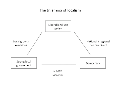
Prof Henry Overman of the LSE has some interesting thoughts on lessons for urban policy from Dani Rodrik's book 'The Globalization Paradox'. I'm particularly interested in Rodrik's concept of an inescapable trilemma governing world economic affairs, according to which "democracy, national sovereignty and global economic integration are mutually incompatible: we can combine any two of the three, but never have all three simultaneously and in full". Or in graphic form:


I wonder whether a similar logic applies to 'localism' and land use policy, as follows

  • Strong local governments which are also very responsive to the local electorate are more likely to be NIMBYist;
  • If you want to combine democratic institutions and liberal land use policy you probably need relatively weak local government, with wider interests represented by elected regional or national tiers promoting growth over local resistance;
  • And if you want strong local government combined with liberal land use policy then a somewhat undemocratic 'local growth machine' is perhaps the best way to get it.

Or if you prefer the graphic version:
No doubt this is a little too neat, but I think there's something to it. Which is troubling for people who like all three things in those boxes.

Monday, 19 September 2011

The Gated City

I've just finished reading Ryan Avent's book The Gated City, which UK readers can download for Kindle or PC/Mac reading here. Anyone interested in why we've got cities in the first place, how we ended up with the ones we have, or what's going to happen to them in future should read it. In an appealingly concise ninety or so pages, you get a very clear explanation of the economic advantages of density, a compelling argument that restricting density leads to significant damage to economic growth prospects as well as social costs, and a critique of the ethics of NIMBYism which is all the more persuasive because it is so even-handed.

For a short book it raises a lot of issues, but I'm going to focus on just one or two. Firstly - and maybe this isn't a particularly fair comment on a deliberately brief tome - at some point I'd like to see a deeper exploration of why so many people have come to oppose development so much. After all, it was only as recently as the mid-1970s that Harvey Molotch was writing about how American cities were controlled by 'local growth machines', mostly driven by real estate developers, that rode roughshod over the interests of ordinary residents.

In a way, it's these growth machines that seem hard to explain now. You can see why residents wanted more control, even leaving aside some of the crimes committed in the name of urban redevelopment. It is natural to want to influence what happens to our neighbourhood, since it affects our quality of life so deeply. It is all the more natural if we are particularly attached to our neighbourhood, if it is particularly unique and attractive, or if our major asset's value is intimately tied to it (in practice, these different factors may be difficult to disentangle). Perhaps NIMBYism, like cleaner environments and longer holidays, is something that we choose to have more of as we become more affluent, even if it comes at the cost of lower overall economic growth (I say 'we', but of course as Ryan says there are real clashes of interest and distributional consequences involved).

And the thing is, falling urban densities over the course of the 20th century did seem to be accompanied by real improvements in quality of life. Present day San Francisco is an extraordinarily pleasant place. So why should those who have paid so much for the pleasure of living there have to accept it being changed, perhaps destroyed?

The Gated City is about answering that question from the perspective of society at large, and it answers it very well. But as persuasive as this rootless technocrat found it I don't think it will win over your average NIMBY in San Jose or Chelsea. So what would work? Ryan mainly suggests radically narrowing the scope of planning rules and respecting the right of people to do what they like with their property, and 'zoning budgets' so that local authorities can't restrict development in one place without freeing it up elsewhere.

I'm not sure about these. One problem with trying to radically limit the role of planning is that restrictive rules are typically extremely popular with local people, so removing them implies some sort of top-down direction that, however beneficial in the aggregate, is likely to cause a good deal of strife. Secondly, I think there is a role for planning in that there really are large potential social costs involved with development which good planning can address. There's a danger that removing the system's ability to address these externalities would just lead to more development with high social costs. The problem is that the role of planning has been left open to addressing any kind of 'impact', so people complain on purely private grounds, albeit sometimes dressed up in social terms. Perhaps I'm naive or just speaking my class interests as a sometime-planner (by the way, see the disclosure at the end of the post), but I'd like to see more of an effort to make it clearer which external costs planning can and should address and what the evidential thresholds for complaints should be before we chuck out planning altogether. As for zoning budgets, unless I'm missing something they don't seem to me to really address the legacy of existing constraints.

So what's left? I do think we could look at ways of ensuring that expensive and restrictive neighbourhoods bear more of the costs of their restrictions, which at the moment are mainly borne by others. In this country the new government has introduced a New Homes Bonus which pays local authorities for each new home completed in their area by matching the council tax income for the new home for the first six years. This will provide some additional incentive to increase supply, but the problem is that if supply increases to anything like the levels we need, much of the funding for the NHB will come from top-slicing central government grant to councils in proportion to the amount they currently receive. This means that those councils most dependent on government grant (i.e. those in deprived areas) will pay more for the NHB (if it ever takes off), unless they can get a lot of homes built themselves. In effect therefore, the strongest incentives tend to apply in the areas with lowest market demand.

I've argued that you could redesign the NHB so that it is paid for by top-slicing grant to councils in proportion to the extent of the affordability problem in each area. That would mean that the areas with highest prices relative to incomes will not just earn no NHB if they don't allow new supply, but would lose out the most in proportionate terms to those councils that are building. At the right rates this could be a sharp incentive indeed, perhaps enough to concentrate minds in some expensive areas places (this is also not a million miles from Glaeser & Gyourko's proposal of a few years back).

Now, that's obviously fairly top-down too. And anything that challenges the status quo enough to really make a change is going to be controversial and hard to implement for precisely that reason. The first step has to be to face up to the real magnitude of the costs we impose on ourselves by unduly limiting densities, and for that reason The Gated City deserves to be read very widely.

Disclosure: This post, like everything else on this blog, is informed by my work at the Greater London Authority on housing and planning policy - as a fairly minor functionary rather than someone with much decision-making power. The big decisions are naturally made by the Mayor and his advisors, taking into account a range of factors which I have the luxury of not having to deal with. Just in case it isn't clear, I'm writing in a completely personal capacity here.

Sunday, 18 September 2011

Congestion and road pricing links

It's been an interesting couple of days in the wacky world of congestion and road pricing. First, the House of Commons Transport Committee tried to identify some ways to address congestion without resorting to road pricing and came up with ... not very much really, just a lot of well-meaning but essentially small-bore stuff about trying to make motorists behave better or think smarter, and the usual griping about roadworks. None of these are going to have a very big impact on congestion, as the committee probably knows. So this report is actually another piece of evidence in support of road pricing, if only by omission.

Secondly, a much less noticed but more rigorous analysis of the issue was provided by the IFS in its Mirrlees Review of Taxation, which looked at a range of issues including 'Taxes on Motoring'. They make the very important point that while the existing fuel tax regime acts as a sort of indirect tax on road use, increasing fuel efficiency has made it less and less effective in this role, which means that our only national brake on congestion gets weaker over time:

However it is done, we do not underestimate the political difficulties of introducing road pricing nationally. But in addition to the long-standing case for such a move, we need urgently to wake up to the fact that, if the UK and other countries are to meet their targets for reductions in greenhouse gas emissions, petrol and diesel use by motor vehicles is likely to have to fall and eventually end as alternative technologies are introduced. This will leave the UK with no tax at all on the very high congestion externalities created by motorists. So, if we all end up driving electric cars, it seems that we shall have no choice but to charge for road use. It will be much easier to introduce such charges while there is a quid pro quo to offer in terms of reduced fuel taxes ... Of all the challenges raised in this volume, this seems to us one that is simply inescapable. It may be another ten years before change becomes urgent, but urgent it will become and the sooner serious advances are made to move the basis of charging to one based on congestion the better.
(emphasis added)

Lastly, Dave Hill of the Guardian makes the case for the crucial role of road pricing in particular and transport policy in general in fostering urban prosperity and quality of life here.

Thursday, 15 September 2011

Speak up

Matt Yglesias recommends that people who want to see progressive policy changes should (a) badger their elected representatives about it and (b) relentlessly tell their friends and family about how progressive policies would improve their lives, even if it basically involves annoying them.
If you are in a car with me and we’re in a rush hour traffic jam, you are damn well going to listen to me talk about congestion pricing. This generally doesn’t work in Washington for national politics, but whatever it is you do I’m sure you interact with lots of “apolitical” or moderately conservative people who remark now and again about things in their life to which politics is relevant. Point this out to them. Tell them who the bad guys are. Recommend some good blogs. Your friend Bob probably thinks he doesn’t care about monetary policy, but does care about the state of the labor market. Explain it to him ... These two things are, I think, the most underrated props of conservative dominance in the United States. Conservatives write and call congress at a much higher rate than progressives, and more-or-less ordinary people hear conservative political messages from preachers and business executives all the time.

That last bit is spot on. If progressives believe that many people's lives would be improved by more redistribution, better public services or (say) widespread congestion pricing, it's odd that many of them are fairly coy about saying so outright and often prefer to keep the discussion in the realm of policy wonkishness.

Perhaps it is because conservative-friendly ideas come pre-legitimised by religion, wealth or power (not to mention a supportive media), while progressive policies often (but not always) involve considerations of the common good trumping immediate self-interest. Maybe that's a harder sell, but that's just all the more reason to put the effort into selling it.

I agree with Matt that road pricing / congestion is a case in point. The example of London shows that it would lead to improvements in quality of life and free up space to provide for buses, pedestrians and cyclists. The benefits would also overwhelmingly flow from the better off to the less well off. Yet hardly anyone seems willing to publicly advocate it. I guess they may be scarred by the experience of the lost Manchester referendum, but then that's a reason to be out there organising support and building coalitions so that the next time around there is a stronger strategy with a stronger chance of winning. In other words, don't be shy about your convictions, because you can be damn sure the other side won't be.

Wednesday, 14 September 2011

Empty homes not to the rescue

Simon Jenkins attacks the NPPF again, and as before the effect is to make you wonder if it's such a bad idea after all. But I just want to pick up on a couple of points he raises. First, there's this:
As for housing, it might seem odd in a recession for a chancellor to be directing savings (and bank loans) from productive investment into the housing market.
That's a bit backwards. Investment in new housing supply is productive, because it's producing something - new houses! There might be more productive investments around, but given the lack of business investment at the moment the idea that spending on new homes would have a big crowding-out effect is way off.

Speculative investment in housing or land assets is not productive, so maybe that's what Jenkins is thinking of. But increasing housing supply to a higher and hopefully stable new level would be a way to reduce this non-productive type of investment, while increasing the productive kind.

Jenkins then honours a time-honoured tradition by arguing that planning reforms are not needed to boost housing supply because of the "750,000 houses lying long-term empty, thanks to the chronic inadequacy of property taxation". This is wrong in two ways. First, in pure factual terms the recorded number of long-term empty homes (i.e. empty for six months or more) in England is 300,000 rather than 750,000, which is roughly the overall total including short-term empties (see table 615 here).

Secondly, and this is something which hardly anyone who raises the specter of empty homes ever properly addresses, the fact is that the places with the most empty homes are also the places with the least housing demand. This really shouldn't be that surprising when you think about it. Broadly, empty homes tend to be most common in areas with an excess of supply over demand, which are obviously not the same as those places which have the greatest excess of demand over supply.


The chart above illustrates the point. There is a clear negative relationship at the regional level between the rate of long-term empty homes and average house prices. Southern regions (including London) tend to have high house prices and low rates of vacancy, while Northern regions tend to have (relatively) low house prices and high rates of vacancy. We can't move all those empty homes to where the people who want housing are, and the people who want housing are strikingly reluctant to move to where the empty homes are, so maybe we do need to build homes where people want to live after all?

Friday, 9 September 2011

The war for the streets

Aaron Naparstek's article from a few months ago on the 'war for the streets' in 1920s America is well worth a read:
University of Virginia professor Peter Norton details the early history of the car and the city in his wonky but fascinating book, Fighting Traffic. He describes the “blood, grief and anger in the American city” and the “violent revolution in the streets” of New York and other U.S. cities as automobile owners bullied their way on to city streets, literally, leaving a trail of mangled children’s bodies in their wake.

In the 1920s, motor vehicle crashes killed more than 200,000 Americans, a staggering number considering how many fewer cars actually existed in those days. These days, 35,000-or-so Americans are killed in car wrecks annually. Most of the dead are drivers and passengers on highways and in rural places. In the 1920s, most of the dead were kids living in cities. In the first four years after the Armistice of World War I, more Americans were killed in car wrecks than had died in battle in France...

Cars were a nuisance and intruder on city streets and drivers were seen as “tyrants that deprived others of their freedom.” City streets were places where kids played, pushcart vendors sold goods and a wide variety of vehicles and traffic moved and intermingled mostly at human-scale speeds. New Yorkers and city people all across America “saw the car not just as a menace to life and limb, but also as an aggressor upon their time-honored rights to city streets.”

It was a war which the car won hands down:
Yet by 1930, the backlash was largely over. The automobile had secured its place on city streets and motordom had won. Rather than conforming to the demands of the American city, the city began its decades-long process of conforming itself to the needs of the automobile...

Changing a city’s infrastructure takes decades. Changing social mores can happen much faster. “Before the city could be physically reconstructed for the sake of motorists, its streets had to be socially reconstructed as places where motorists unquestionably belonged,” Norton writes. By 1930, that social reconstruction was largely complete. New Yorkers had mostly accepted the automobile in their midst, despite the fact that 10 years earlier, many considered it to be nothing more than street-clogging, exhaust-spewing, horn-honking, child-killer owned and operated by a small number of wealthy elites.

As Naparstek says, those statistics on road casualties in the 1920s are shocking, in comparison to much smaller casualty figures today which we quite rightly regard as unacceptable. I was interested in what the equivalent figures might be for London, so I put together the chart below from a range of sources, mostly annual statistical abstracts published by the London County Council or its successor the GLC. The chart shows the trend in annual traffic fatalities in London between 1901 and 2010, with the red line (up to 1966) referring to the Metropolitan Police District area and the blue line (1966 onwards) the current Greater London area, both including the City of London.


What the chart shows is that annual traffic fatalities in London rose rapidly from the start of the century, with an interruption at the time of the first world war, and peaked in the early 1930s. In 1933 1,458 people were killed on London's roads. That's an average of four people every day. The general trend has been downwards ever since, apart from another large trough during the second world war and the subsequent rationing period. In 2010 'only' 126 people were killed on London's roads, less than a tenth of the 1933 figure. There were many more non-fatal casualties too, with a total number of casualties (deaths plus injuries) of 59,080 in 1933 and 60,958 in 1934, more than twice as much as in 2010*.

Overall, the 1920s and 30s saw a level of carnage on the roads that would be difficult to imagine today. I don't know much about the metropolitan politics of this period but my understanding is that the London authorities responded in much the same way as those in America: by trying to get pedestrians and cyclists out of the way of motor traffic, and by making the roads 'safer' for cars to drive through, mostly by widening and straightening them. Individuals, for their own part, sought to protect themselves: people who could afford cars bought them, and overall car ownership grew very quickly. At the same time, businesses were switching en masse to motorised transport.

These were all understandable reactions, and over the long run we did see road deaths come down (partly for a host of other reasons, of course), but not without huge costs. By making life harder for pedestrians and cyclists and easier for drivers, the authorities reinforced the individual incentive to protect oneself in one's own steel box, and helped make the car completely dominant, which brought problems of congestion, pollution (which kills plenty of people itself, none of whom are shown in that chart), noise and an ever-present danger which sucked the life out of so many city streets.

It's worthwhile considering an alternative history, one in which the city authorities tried to tackle the problem of road deaths at its source rather than seeking to make roads safer for cars. What if they had imposed a toll or charge on motor vehicles equivalent to the costs they imposed on everyone else, or banned them altogether from parts of the city? Traffic levels would have been much lower, pedestrians and cyclists would have felt safer, and there would have been much less need to redesign streets to accommodate motor vehicles. Car ownership would presumably still have grown, but not to the point where it dominated everything else. We might have ended up in a good equilibrium were people felt free to choose less damaging forms of transport, rather than the one we're in now.

It's easy to say this in hindsight, obviously. The political will and perhaps the technology were not in place to do this in the early 20th century. But that doesn't mean we have to live with the consequences of the wrong decision all these years later. London has already gone some distance towards reducing the dominance of motor vehicles in the city centre, but we can and should go further.

* Total casualties, as distinct from fatalities, didn't actually peak until 1967. I'm planning a post for londontransportdata that will go into all this in more detail.

Taxi cabs: Deregulate and tax

Matt Yglesias says people who want to see less car ownership, less space used for parking and less driving overall "should support relaxing regulatory curbs on the number of taxis allowed to operate in a given place". I think I'd like to see this happen in London, with one small condition: they pay a per-kilometer tax to cover their external costs of congestion, pollution, noise and death/injury through collisions. Currently we don't tax these external costs so they create a lot of problems for everyone else. Removing one type of economic distortion without removing the other will just lead to more of these problems.

Wednesday, 7 September 2011

Let's get dense

I've been reading Ryan Avent's new book The Gated City, and it provides some good arguments in favour of the point I was making about prosperous cities needing to grow up as well as out.

As I said, in the debate over the National Planning Policy Framework I think there has been an undue focus on the virtues of making land on urban fringes available to develop at low prices, because that will lower costs for businesses and households. Avent's argument, as I understand it, is that we should be most concerned with the costs facing high-productivity or highly growth-promoting firms (and the people they employ), and they are much more likely to want to locate in dense urban areas because of the positive impact of density on productivity, innovation and entrepreneurship. So we should be at least as worried about restrictions on densifying in city centres as we are about restrictions on expansion of suburban areas.

You could argue that this is a false opposition and that cheaper land on the fringe will reduce pressure on the centre. The problem is I'm not sure the two locations are good substitutes. To generalise a bit crudely, those that like fringe locations - sprawl developers, lovers of low density housing and low productivity firms- will benefit from cheaper fringe land, while those who don't - higher density developers, lovers of higher density areas and higher productivity firms - will not. Of course, compact, well-planned urban expansion could potentially give us the best of both worlds, but we don't seem to be very good at that in this country and the current draft of the NPPF doesn't really encourage it.

The bottom line is that real estate prices are generally highest in urban centres. Insofar as that represents the market signalling something, it is a strong signal to build more in urban centres, and only a weak signal to build more on suburban fringes. 'Land supply' isn't everything, at least as it's generally conceived: what we are allowed to do with already-developed land is just as important.

Tuesday, 6 September 2011

People should read Ryan Avent and Andrew Lainton

Just a quick post to point anyone interested in housing and planning issues towards two people currently writing up a storm on these issues.

Ryan Avent blogs for the Economist but has a long-standing interest in urban economics and housing in particular. He has just come out with a slim Kindle-only book, The Gated City, which is concerned with the negative aggregate consequences of anti-density building restrictions in America's most productive places, its cities. I'm reading it at the moment and am very impressed, and incidentally the argument applies just as much to London as it does to San Francisco. Ryan wrote an op-ed for the NY Times summarising the book here.

Then there's Andrew Lainton, who I hope everyone with a passing interest in the NPPF debate is following. It's always good to see someone who manages to be both expert and consistently interesting writing so much, but with the kerfuffle about the NPPF I think Andrew has really found his issue, and he deserves that shout-out from George Monbiot today.

Friday, 2 September 2011

We need to measure subjective cycle safety


Following the recent tragic death of a cyclist in on Cavendish Road in Clapham, a local resident who witnessed the crash asked TfL what they could do to make the road safer, especially in light of a report back in 2008 which recommended that the junction in question needed to be redesigned to make it safer.

TfL said no. Here's their reasoning, posted by LCC on one of their comment threads:
...We found that in this section of Cavendish Road there had been 11 collisions in the last three years (up to 30 April 2011; collision data is supplied to us by the Police, and this is the most recent data available).  None of these collisions involved cyclists and two resulted in serious injury.  This particular section carries a large volume of traffic, more so in fact than the majority of other A roads in the borough.  Given the volume of traffic and when compared to other, similar roads there have been a relative low number of collisions on this section of Cavendish Road.  As I said, TfL is data led in its approach to progressing schemes on the Transport for London Road Network.  We could not progress a safety scheme at a location at which there had been fewer collisions than at other areas.  For this reason, we have no plans to progress a scheme at this section.  I appreciate that this is a sensitive issue, and would be happy to discuss further...

TfL appear to be saying that they will not consider trying to make a road safer for cyclists until a sufficient number of them are killed or injured on it. The obvious problem with this is that people tend to avoid cycling on a road if it seems unsafe or threatening, but by TfL's logic a road with no cyclists must be a road that is perfectly safe to cycle on.

I think this calls for cycle campaigners to try and produce some better data on how safe and friendly cyclists or would-be cyclists perceive different streets to be. We need objective data on subjective perceptions, in other words. This kind of thing is relatively easily available at large scales from sample surveys (see this recent one from Manchester for example), but what we're really interested in is identifying which individual streets and junctions are the most cycle friendly, and which need the most work to make them safe and inviting.

A while back I proposed something along these lines on the GB Cycling Embassy forums, with the idea being to get people to rate images taken from Google Streetview, but I haven't developed it any further, mainly because I don't have any IT skills.

But now some smart people from MIT have come along and produced something very similar called Place Pulse, which posts two random Streetview images from a handful of cities in the US and Europe and asks people which looks safer. Screenshot below:


They then analyse the results to see which places look safer. It's striking how the places rated as safest are all in Austria and mostly very pedestrian friendly while the least safe are all car-dominated streetscapes in the US.

Place Pulse is focused on 'safety' in the widest sense, but it shows that you could do something similar for cycle safety, and then use the results to understand what people associate with safe or unsafe cycling environments. And then maybe we could get TfL to understand that they should be proactively trying to build streets that invite cycling.

Grow up as well as out


It has been fascinating to see debate about housing take over the news and comment pages in the last couple of weeks, started by arguments over the government's very radical draft National Planning Policy Framework and carried on this week by a timely intervention by the National Housing Federation, cannily exploiting the media's obsession with homeownershp.

I'm delighted to see some serious discussions about housing supply (this one between Tom Chance of the London Greens and Matt Griffith of PricedOut being a great example), but I do have a gripe, which is that most of the supply debate has focused almost exclusively on the rights and wrongs of making more sites in greenfield areas available for development. I agree we do need some of those, and we should be thinking about both how to expand existing towns and maybe planning a few new ones, we can't ignore the fact that the greatest demand for new housing is where housing already is, in our existing urban and suburban areas. Given the scarcity of housing many people would live in a new town or former greenfield estate if we build them, but most of them would prefer to live where the facilities and transport and the other people already are.

The focus on new greenfield sites suits the big housebuilders, who in many cases already own them and understandably want to be able to freely pick and choose which to develop. But there's no guarantee they would build out and release those sites onto the market any faster. We need to improve competition in housebuilding, and that means making it easier for anyone, including homeowners and smaller housebuilders, to redevelop the existing housing stock. This would include allowing homeowners to add floors to their houses, and replacing houses with flats.

Now, some neighbours hate this kind of thing, so they complain to the politicians and the politicians put policies in local plans about 'respecting local context' and new development being 'in keeping' with neighbouring properties, and so on. At every point it seems like the easy thing to do is to push development elsewhere. But in the aggregate this has a huge cost, because we end up not building where people want to live but building where most of them don't want to live, just to please people who don't like the idea of housing development nearby. Letting those are already housed push out those who aren't is not just hypocritical, it's also deeply unsustainable since densifying existing areas saves huge amounts of energy.

Our towns and cities need to be able to change in response to society's needs. They need to grow upwards as well as outwards.

Thursday, 1 September 2011

Disentangling economic and environmental NIMBYism is hard

As Gabriel Ahlfeldt of the LSE says, people oppose new developments in their local area for all sorts of reasons, and disentangling these can be difficult. In particular, people might use the rhetoric of environmental concern to dress up a more nakedly economic interest in the value of their own property. He highlights his recent research which supports this, having found that homeowners in Germany were more concerned than renters about the impact of aircraft noise from the proposed construction of a nearby airport.

This is evidence for the homevoter hypothesis that homeowners have a strong interest in preserving the value of their home, while renters have an interest in driving down rents, on top of any environmental concerns they might share*.

More broadly, I think the way economic and environmental concerns overlap for homeowners goes a long way to explain the strength of some opposition to new housing supply. Because house prices depend to a large extent on local environmental quality ('amenity'), new supply that is large enough to change the perceived quality of the local environment for the worse will have a double impact on house prices - first the direct effect of more supply, and then the indirect effect of amenity change. In economic terms, the direct effect shifts the supply curve outwards (lowering price), while the indirect effect shifts the demand curve inwards (lowering it even more). The combined effect on prices could be very large, so it's no wonder that some homeowners are so vehemently opposed to new housing supply in their area.

*Though I'd be interested to see if there was any way to separate out other ways in which homeowners might differ from renters, for example whether they see themselves as committed long-term to the area or just 'passing through'. If renters are less likely to see themselves staying in an area for a long time, we might expect them to care less about the impact of a new airport and that might skew the results somewhat.

Saturday, 27 August 2011

Local ties

Here's a really interesting post from Kevin Harris about the forces that fostered strong local ties in the post-war years, creating the kind of dense social networks where everyone knew everyone else:

Here are some contributory factors that come to mind:

- routinised lifestyles and a high proportion of mothers as housewives
- lower car ownership, with playable streets
- more local employment and local schools, to which people walked or cycled
- availability of local trade, ditto
- ties that overlapped in the spheres of leisure and workplace as well as home environment
- a heritage of deference to authority (which depended often on unhealthy, disempowering relationships)
- housing that people valued.

Sounds about right to me, and it highlights how an era that many seem to hearken back to resulted from a unique conjuncture of historical trajectories, some of which we probably wouldn't want to turn back even if we could, the lack of autonomy for women being an example.

I think it's particularly important to emphasise the geographically circumscribed nature of society and the economy at the time: overseas trade was much less significant in the 1950s and 1960s than today (see chart below, from here), which meant that effectively more people were producing for their neighbours, near-neighbours or compatriots, while both transport and communication technologies were more expensive and less widely available. That all meant that people devoted more time and attention to those nearby and so local ties were stronger, but partly because there was just less choice then. We've got much more choice now in what we consume and where we go and who we talk to - the potential spatial scope of our social networks has grown massively, so it's no wonder that local ties have weakened.


That's obviously not to say that the change has been unambiguously good. Maybe we've unwittingly crossed a threshold whereby the strength of local networks has collapsed more than we would consciously want. And anyone who wants to foster the desirable aspects of strong local networks probably needs to work a lot harder at fostering them (Kevin has some ideas), because I don't think the economic and social conditions that produced them in the post-war years are going to come back any time soon.

Friday, 5 August 2011

Rent is too damn high

Good news - Matt Yglesias is to write a book about housing policy, provisionally entitled 'Rent is Too Damn High' (see also). I'm fairly sympathetic to the broad Yglesian position on housing policy, which I understand to include the following points:

Pareto improvements are extremely thin on the ground in housing policy, more so than in most areas. This means that it is very difficult to please one group of people without severely displeasing another. For example, loose housing supply in a local area benefits newcomers but harms existing owner-occupiers, while tight supply harms (by excluding) newcomers but benefits existing owners. Existing owners tend to be economically self-interested and more politically powerful than would-be newcomers, so supply tends to be tight. Also, fragmenting land ownership arguably creates a kind of 'anti-commons' wherein individuals can block changes that would benefit society as a whole.

Housing supply decisions have economic, environmental, aesthetic and social ramifications, often in different directions - but very few of the actors involved in debates over housing have any incentive to take all of these into account, let alone the ability to do so. For example, a block of flats in a nice area might be undesirable on aesthetic grounds but provide cheap accommodation for those who need it. There are real and important dilemmas here, but they often seem to go unacknowledged. Another way of saying it is that housing policy affects the distribution of many important resources as much as income does, yet its distributional role seems to go mostly undiscussed.

Wednesday, 27 July 2011

London Transport Data blog

Together with some associates, I have started up a new blog which will cover London transport data. We gave it the witty name London Transport Data, and you can find it here, with a mission statement of sorts here. Expect some cross-posting, starting today.

Trends in motor vehicle traffic in London

The Department for Transport published new estimates of motor vehicle traffic yesterday, covering the years up to 2010 and quarters up to Q1 2011. There are a range of accompanying data tables but we have picked out a few trends specific to London. All the charts below show indexed trends, with 1993 set to 100.

Traffic in London and England
Overall motor vehicle has fallen for three years in a row in both London and England as a whole, but in London this was preceded by a nine-year stretch of basically flat traffic levels, while traffic continued to grow quite strongly in England as a whole.


Traffic in Inner and Outer London
Within London there has been a clear divergence in the traffic trend between Inner and Outer London. Between 1999 and 2007 traffic grew slightly in Outer London and fell slightly in Inner London, while since 2007 traffic has fallen in both areas, but faster in the inner city.


Car vs non-car motor vehicle traffic in London
Car traffic in London as a whole has been falling since 2002, while non-car motorised traffic continued growing strongly until 2007, from which point it has dropped sharply in the last three years.


You can download the data for the charts in CSV format here.

Originally posted at London Transport Data.

Monday, 18 July 2011

See something or say something - Eric Fischer's flickr/Twitter maps

See something or say something: London

I was going to write up some thoughts on what we can learn about cities from Eric Fischer's beautiful new maps of tweets and flickr photos (London above), but this interview with Eric pretty much covers it. I would just add that 'flickr density' might be a useful proxy for amenity value in economic or geographic analysis.

You should also go enjoy the full set of maps here. The man's a genius.

Tuesday, 5 July 2011

Where the NIMBYs are

NatCen have a new report out summarising the results of a survey (commissioned by the previous government) into attitudes towards housing in England. There's lots of interesting stuff in there about tenure aspirations and so on, but I wanted to focus on the section about attitudes towards new housing supply.

Survey respondents were asked whether they would support or oppose more homes being built in their local area. The headline result is that only 29% of respondents support more homes being built in their local area, while 46% were opposed and 23% were neither supportive or opposed. But I'm more interested in the underlying factors, so the charts below break down the results by a variety of categories, with those who neither supported nor opposed new housing excluded for the sake of clarity.


It's pretty striking that opposition to new housing supply is highest in Outer London and lowest in Inner London. Inner London is the only part of the country to have a substantial plurality in favour of new supply.


In general, it is in larger urban areas where support for new housing is highest and in suburbs, small towns or the country where opposition is strongest. But are attitudes just a function of geography or does that mask some other more important factors?


We can't really isolate causation from this data but the breakdown by household income is rather suggestive. It shows that the poorest households are the most supportive of new housing supply and those in the upper half of the income distribution the most opposed.


Finally, there are stark differences according to the current housing tenure of the respondent. People in social housing are on average in favour of new housing supply, people who rent privately are basically split, and a large plurality of owner occupiers are opposed.

The fact that Inner London has a higher proportion of low income and/or renting households probably goes a long way to explaining why it has the highest support for new supply in the country. The tenure comparison also supports the case for an economic rationale behind attitudes to new supply. Owner occupiers would tend to have the least need for new supply and the most to lose if new supply brings down house prices, while social housing tenants have little incentive to worry about lower local prices and are more likely to know someone who needs a home or be in need of one themselves. And perhaps private renters are somewhere in the middle.

As a final point, I'd just like to emphasise that we tend to think of attitudes to new housing supply as a personal matter, but it has potentially huge implications for the lives of other people. If we succesfully oppose new housing supply in our local area we make it more difficult for people to find a decent, affordable place to live. We may not ever meet those people or even be aware of their existence, but they exist alright. This is in large part a moral issue, and I think we should be willing to discuss our attitudes to it in terms of their moral consequences.

Friday, 1 July 2011

Cycling journey times are very reliable

A couple of sources on cycle journey time reliability. First there's TfL's report of August 2009, which finds (para 10.4) that:
journey times are very consistent per rider, and far more independent of traffic conditions than [for] larger vehicles such as cars. Cyclists do not travel in the main traffic stream and therefore avoid the main barriers (barring signals) that other road users face

Then there's a survey done by the Chartered Management Institute in 2004, which doesn't appear to be available itself any more but is referenced in a few places, notably this Haringey Council document:
According to a Chartered Management Institute survey (2004) of 4,000 of their members, cyclists are more likely to arrive at work on time, and are more productive and less prone to stress than their counterparts arriving by car or public transport. The Institute found that 58% of cyclists say they are never disrupted by traffic, compared to only four per cent of drivers. Nine per cent of cyclists say they are stressed by their journey to work, compared to nearly 40% of drivers; almost a quarter of motorists feel their productivity is affected by the stress of their commute, compared to zero percent of the cyclists.

The upshot is that cycling journey times are very reliable, much more reliable than car journeys, because cyclists can usually filter through stationary traffic. This implies that if more people switched from cars to bikes then overall journey time reliability would go up, all else equal. But if your main measure of journey time reliability excludes cyclists and focuses only on motor vehicle traffic, as TfL's does, then the risk is that your attempts to improve reliability for motor vehicles will come at the expense of a mode which will always be much more reliable.

"Exponentially diminishing collective returns"

The New York Times is hosting a discussion on the somewhat over-hyped distinction it has drawn between European cities supposedly out to make motorists' lives a misery and American cities which are not. I like Tom Vanderbilt's contribution best, as I think it puts the idea that cities should be remade around cars in its proper historical place:
The idea that a city like New York could be made wholly compatible with the car looks increasingly antique, a paved-with-good-intentions fever dream now as obsolete as the idea of tower-block housing projects. As Michael Frumin, a transportation expert, once observed, if the morning subway commute were to be conducted by car, we would need 84 Queens Midtown Tunnels, 76 Brooklyn Bridges or 200 Fifth Avenues.

The car, with its exponentially diminishing collective returns — for example, traffic — is not the solution to mobility in the increasingly crowded cities of the 21st century. The sooner we put this flat-earth belief behind us, the faster we can get along with ideas for more efficient forms of mobility.

I love that phrase - exponentially diminishing collective returns!

Monday, 27 June 2011

NBER papers on transport and labour economics

The NBER publish some good economics! Here are a couple of new working papers I liked the sound of :
Pounds that Kill: The External Costs of Vehicle Weight
Michael Anderson, Maximilian Auffhammer

Heavier vehicles are safer for their own occupants but more hazardous for the occupants of other vehicles. In this paper we estimate the increased probability of fatalities from being hit by a heavier vehicle in a collision. We show that, controlling for own-vehicle weight, being hit by a vehicle that is 1,000 pounds heavier results in a 47% increase in the baseline fatality probability. Estimation results further suggest that the fatality risk is even higher if the striking vehicle is a light truck (SUV, pickup truck, or minivan). We calculate that the value of the external risk generated by the gain in fleet weight since 1989 is approximately 27 cents per gallon of gasoline. We further calculate that the total fatality externality is roughly equivalent to a gas tax of $1.08 per gallon. We consider two policy options for internalizing this external cost: a gas tax and an optimal weight varying mileage tax. Comparing these options, we find that the cost is similar for most vehicles.

(See also my post on external accident risk)

The Incidence of Local Labor Demand Shocks
Matthew J. Notowidigdo

Low-skill workers are comparatively immobile: when labor demand slumps in a city, low-skill workers are disproportionately likely to remain to face declining wages and employment. This paper estimates the extent to which (falling) housing prices and (rising) social transfers can account for this fact using a spatial equilibrium model. Nonlinear reduced form estimates of the model using U.S. Census data document that positive labor demand shocks increase population more than negative shocks reduce population, this asymmetry is larger for low-skill workers, and such an asymmetry is absent for wages, housing values, and rental prices. GMM estimates of the full model suggest that the comparative immobility of low-skill workers is not due to higher mobility costs per se, but rather a lower incidence of adverse labor demand shocks.

In other words, policies that protect against unemployment and poverty also reduce mobility, which obviously doesn't mean the policies aren't worthwhile but does tend to increase the likelihood of both spatially concentrated and temporally extended unemployment.

Sunday, 26 June 2011

Nicer inner cities might be a mixed blessing for people on low incomes

Ben Rogers, writing in the Standard, gets to the heart of dilemmas around aspirations towards 'mixed communities' in the face of economic forces that seem to be acting against them. Read the whole thing, but here is an extract:
As property prices go up, lower earners will be squeezed out. In the absence of a massive house-building programme in central London, the capital will become to feel more like Paris, with a rich centre and a poorer outer-ring. Rent policy can slow or hasten this process but not reverse it.

Should we care? Instinctively I want to answer "yes". I look on with misgivings as the Highbury street on which I live becomes steadily fancier - even though I know that I have contributed to that process and stand to gain from it financially.

It has been an article of faith among socially-minded reformers since the days of Joseph Rowntree and Ebenezer Howard that "mixed communities" are a good thing and income segregation bad. Yet the evidence in favour of mixed-income neighbourhoods is weak. Poor children from rich neighbourhoods do not seem to do any better in life than those from poor neighbourhoods. LSE economists Paul Cheshire and Henry Overman argue that there might even be benefits for poor people living in poor neighbourhoods: shops are cheaper and public services tailored to them.

The evidence on the impacts of mixed communities is indeed fairly mixed, and the point about costs is an important one, but I'm not sure it's the whole story. If the cheaper areas of the future are going to be in the suburbs then the cost of transport for the poor to get to city centre jobs is going to be higher. School quality and environmental amenity are also likely to be lower in cheaper areas - that's part of the reason why they're cheaper, after all.

So I think the benefits to the poor of being 'squeezed out' of affluent city centres are still fairly ambiguous, even leaving aside the very large transitional costs facing anyone who does make such a move (as demonstrated by the fact that the people affected by the cuts to housing benefit generally seem pretty unhappy about it).

More broadly I think these dilemmas highlight a very important shift in how our cities function. To simplify massively, in the past when cities had lots of dirty industry they had dirty environments as a result, particularly towards the centre. That encouraged richer people to move out of inner cities as soon as they could afford to and transport allowed. On the other hand, poorer people could save on transport costs by living in the centre, close to the jobs but also close to the pollution.

But over time, as incomes rose and as environmental regulation strengthened, cities lost most of their dirty industry (and associated crime, perhaps). Inner city environments improved drastically, which meant that the rich have started to come back in, lowering their transport costs at the same time. That pushes up housing costs in the centre. So the poor have to choose between staying put and paying higher housing costs, or moving out and paying higher transport costs. That's if the poor rent in the private sector, anyway. If they own their own place or live in social housing, they get to benefit from an improved inner city environment without higher housing costs. So there's an argument that inner city social housing is of increasing benefit to the poor as city centre environments improve. You can also see why it's of increasing interest to those who think we should sell it off.

Obviously that's a very broad sketch with quite a few simplifications and assumptions thrown in[1]. But I think the link between 'greener cities' and displacement of the poor is real enough.

[1] E.g. it assumes that the centre still has the lion's share of the jobs, which is the case in many European cities but not in some US ones.