Sunday, 27 January 2013

Seasonality of road casualties

The other day a few people were discussing on Twitter whether cycling was statistically more dangerous, in terms of casualties per mile, during winter than during summer. This is something I tend to wonder while cycling home in the dark, so I thought I'd try and investigate.

I used DfT's data on reported road casualties in 2011,  the most recent year available. Using just one year's data means the patterns observed may be affected by unusual weather patterns in that year, so you should treat the results as fairly provisional. Another issue with the data is unreporting, so I have focused on fatal or serious injuries which we assume are less likely to be unreported.

Most of the data cleaning and analysis was done with R, and I've copied my code at the bottom of the post. I'm no expert at R so I'm sure the code could be improved, but if anybody wants to use it then feel free.

The DfT data includes all kinds of roads casualties including those suffered while atop horses or tractors, but to keep things simple I've restricted the analysis to pedestrians, cyclists and car occupants (excluding taxis and private hire vehicles). The chart below shows the total number of fatal and serious casualties in England and Wales by road user type and month in 2011:


You can see the different patterns for each mode more clearly if you split them out:


What you see are very clear seasonal patterns for pedestrians and cyclists, with pedestrian casualties rising as winter draws in and then reaching a trough in summer, and cyclist casualties following more or less an opposite trend. There doesn't seem to be much of a pattern for car occupants, although the number of casualties is highest in December and January.

Here's the same chart for London:


The raw numbers shift around a lot because London's mode share is so different, with a lot more pedestrians and cyclists and less car traffic than in the rest of the country. But the seasonal patterns look a little different too. In particular there is a much bigger increase in pedestrian casualties towards the end of the year, and December has nearly twice as many as January.

For cyclists the obvious explanation for higher casualties in summer months is that more people cycle at that time of year. For pedestrians the logic is less clear. It doesn't seem likely that there is much more walking done in the winter months than in the summer. So the winter months, particularly December, just seem to be more risky. Nationally, the worst days for fatal or serious pedestrian casualties in 2011 were the 9th, 12th and 16th of December. There was plenty of snow that month but I wonder whether there is also some sort of 'Christmas party effect' at work here, on both pedestrians and drivers (by the way, in the US the deadliest day for pedestrians is apparently New Year's Day - see also this).

To calculate a casualty rate you divide casualties by some measure of traffic or trips. For pedestrians there's no such data that I know of. But TfL count cars and bikes passing various points on the London road network, and they have made the cycling data available via FOI in the form of this big Excel spreadsheet. This data is patchy for some count points but you can fill in the gaps with estimates based on the ones with complete data.

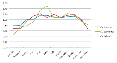
The other option for estimating monthly cycle trips is to use TfL's counts of cycle hires. The chart below compares monthly trends in fatal/serious bike casualties, TfL cycle counts and cycle hires, by expressing each month's figure as a ratio of the average.


Now, you probably shouldn't read too much into this comparison as it's comparing one imperfect data source with another two imperfect ones gathered at different spatial scales. But it does look like there is a bigger increase in casualties between January and June than there is in either of the trip indicators. This suggests, again very provisionally given the limitations of the data, that the number of casualties per cycling trip may be lower in the first few months of the year than in summer.

We really need a more comprehensive analysis to establish if this really is the case, but if it was what would explain it? Perhaps people who cycle all year may be more careful or skilled than those who only take to their bikes in summer. Maybe drivers may look out for cyclists more in winter. At this stage, we just don't know.


Wednesday, 23 January 2013

A better map of population density


If you want to produce a map of population density the usual way to go about it is to get some Census data on density in different zones (wards, Census tracts, etc) and plot it like the map below, which shows 2011 population density in London at Middle Super Output Area (MSOA) level (darker colours represent higher density).

This approach has the virtues of being quick and a fairly standard approach, but there are serious drawbacks too. The most serious one is that this map doesn't really show you the distribution of population, because it hides the fact that across large swathes of London there are no people whatsoever. Much of London's area comprises water (only partially represented in the map above in the shape of the Thames), parkland, transport, industrial or commercial property, or some other non-residential use.

Not only do choropleth maps of this kind not show these variations in land use, but by analogy the calculation of population density across the whole area of each zone will greatly understate the 'real' density of population in zones with little residential land. Look at the very centre of the map, for example. That white blob is the City of London, and this map is telling us that it has very low population density, similar to London's semi-rural outskirts. In the sense of 'population per hectare of all land', that's true, because most of the City comprises commercial property with nobody living there. But there are some residential areas in the City and in these areas people live at fairly high densities. So in terms of 'population per hectare of residential land' the map is quite misleading.

We may get a more realistic picture from a dasymetric map. This type of map combines the same kind of population data with separate data on land use, so that only the relevant areas are highlighted. For our purposes we are interested in residential land, and for that I went to the European Environment Agency's Urban Atlas maps of urban land use based on 2006 satellite data. Using R I extracted from the London map the area covered by continuous or discontinuous 'urban fabric' and also any construction sites, as most of these will be for housing. While 'urban fabric' sounds a bit general there are categories for industrial, commercial, transport, water, green, forest, leisure and other land uses so I was fairly confident that it represented residential land reasonably accurately.

Using QGIS I joined this residential land layer to the same data on population at MSOA level from the Census, recalculated population density in each MSOA on the basis of the residential land only, linked the results back onto the residential layer, and mapped it:


Click on the image for a bigger version (or find the full size 7mb behemoth here).

What we end up with is, I think, a much better map of London's population density, because it shows only the residential areas (or a close approximation) and it doesn't artificially reduce density in mostly non-residential areas like the City or indeed Bromley or neighbourhoods bordering the Lea valley.

Using this approach also changes the ranking of boroughs in terms of population density. Measured in gross terms (that is, across all land), Islington had the highest population density of any London borough in 2011 at 139 people per hectare. But looking only at residential land Islington's net population density was 181 people per hectare - higher, but not nearly as high as Tower Hamlets at 256. And this makes sense - Tower Hamlets has large areas of non-residential land (much of Canary Wharf, for example), but what residential land it does have tends to be pretty densely occupied.

I should say that this map is far from a perfect representation of reality. It has a number of flaws, such as the combination of land use data from 2006 with population data from 2011, so that it undoubtedly misses out some residential areas created in the interim. It divides the entire range of population densities into only four categories which are then treated as internally identical. And similarly, like all spatially aggregated data it hides variation within each zone, in this case MSOAs. I could have used the smaller Output Area geography, but it would have taken more time and more computing power than I wanted.

Update, 1 Feb: Here's a scrollable, zoomable version of the full-size map for you to explore:

Thursday, 17 January 2013

Bike lanes, livability and displacement

The fact that the Evening Standard's property section is now running features about "good-value homes within cycling distance of the office" is good news for cycling as a cause, but perhaps not so good if you're just a normal self-interested cyclist.

Back in the good old days when cycling in London was a freakishly unusual thing to do, whether some place was within cycling distance of the City or not didn't affect its valuation much because there weren't enough cyclists for it to matter. So if you happened to be one of that small number of cyclists you enjoyed a quick commute without having to pay a price premium for it.

But now that cycling has become popular enough in Inner London for even estate agents to notice, "within cycling distance" has become a saleable feature and accordingly comes with a price tag. Given enough cyclists, things like infrastructure quality will start affecting prices too: if someone builds a great bike lane from your flat to the City then more people will want to move there to avail of it, overall market demand will go up and so will the property value.

Now, if you use the bike lane enough you might think the higher price is still worth it. And if you already own a flat in the area you might be pleased too, even if you don't use the bike lane, because your property value just went up. But tenants who don't cycle will be worst off as they'll see their rent go up for no benefit.

This kind of concern is why people sometimes campaign against what others see as entirely benign neighbourhood improvements, and it's what motivates polemics like this one against "livability" defined in terms of supposedly ephemeral amenities like bike lanes rather than the more 'real' livability concerns of jobs, transport and housing.

Campaigns against bike lanes can seem fairly insane, and to be honest sometimes they are, but sometimes they are part of a wider struggle over processes of neighbourhood change, gentrification and displacement. Advocates of livability improvements generally don't intend to displace anyone, but in my view it is irresponsible to not at least consider these price effects and the likely social consequences.

Displacement is not inevitable, though. Higher housing demand can be offset by higher housing supply, moderating or even eliminating the price impact while enabling more people to enjoy these new amenities. Of course, people tend to be hostile to new housing supply in their area so campaigners usually choose to avoid the topic, but there's really no getting away from the market dynamics. If you make a place more attractive without making it possible for more people to live there, prices will go up and people will get displaced. Is that really what you want?

Sunday, 13 January 2013

Surveys about cycling


Just a quick post about a couple of interesting surveys of people's attitudes to different types of cycling infrastructure. First, via Ian Walker on Twitter, is a survey in the Vancouver region which found:
The best route types to encourage cycling were:
- paved off-street bike paths
- residential streets with traffic calming
- cycle paths next to major streets, but separated from motor vehicles by a curb or other barrier (also known as "cycle tracks")
The findings include this chart showing how regular, occasional and 'potential' cyclists all feel about different types of route and infrastructure.

16 Route Types, Average Likelihood of Choosing by Cyclist Type
Second, a survey in Bristol which is interesting because it asked non-cyclists their views on cycling provision:
When asked to assess their cycle route to work, only 10% of non-cyclists were happy with their commute's cycling potential (indicated by a rating of 'excellent', 'very good' or 'good'). 21% said it was OK, and 35% said it was poor or very poor, with the other third of respondents unsure. 
72% indicated that their major reason for not cycling to work was because it would be 'unsafe/stressful' to do so. This was the stand-out response. Reinforcing this response, almost exactly the same number (71%) of non-cyclists agreed that they would consider cycling more frequently if safe, well-connected, physically segregated cycle ways were provided for the majority of their commute.

Tuesday, 1 January 2013

People in London go out of their way to avoid cycling on busy roads

Transport for London's latest annual Travel in London report is, as usual, full of interesting information. I found this paragraph from p. 122 on attitudes to cycling particularly striking:
Cyclists generally feel safer on quieter roads. A survey of Londoners found that cyclists consider quiet roads to be safer than busy roads. Four-fifths consider quiet roads to be safe, compared with 49 per cent (regular cyclists) or 28 per cent (occasional cyclists) for busy roads. A recent study of current cyclists in London found that cyclists were willing to increase their journey time to travel on better, safer routes. Current London cyclists are prepared to travel further to cycle in cycle lanes, bus lanes, on residential roads and would travel three times further to cycle on off-road routes. Around half of all cyclists would change their route to travel through parks and green spaces, or to travel on a dedicated on-road cycle lane. And around 40 per cent said they would change their route in order to use a Cycle Superhighway.
The key fact is that only 28% of occasional cyclists in London think busy roads are safe, compared to a majority who think quiet roads are safe. That may sound obvious to some, but to me it shows illustrates two important points:

  • Most people don't think cycling itself is unsafe, just cycling in heavy traffic.
  • Busy roads are more likely to have cycling 'infrastructure' such as advisory cycle lanes, but they don't seem to have much impact on safety perceptions. This suggests we need better infrastructure, a la the Netherlands.
The research about how far out of their way people are willing to go for a safe cycle route is also important. Choosing a slower but safer route is a form of 'avertive' behaviour, just like people moving away from a polluted road. It lowers the observed costs in the form of road accidents (or respiratory disease from the polluted road) but it increases the hidden costs borne by people in the form of higher expenditure of time or money to avoid the problem. Avertive behaviour prompted by unsafe cycling conditions ranges from finding a slower but safer route to spending loads of money on luminous clothing to not cycling at all. These costs are very large but to my knowledge are not well accounted for in current transport assessment methods.


Monday, 17 December 2012

Car ownership is falling in London but car traffic is falling even faster

The last couple of weeks have seen some interesting figures confirming the decline of car culture in London. First, the 2011 Census results showed, as summarised by London City Cyclists, that the number of car-free households is growing across Inner London. Then the National Travel Survey showed that car travel per person in London fell 22% in just seven years (table NTS9904 here). Finally, as pointed out by Angus Hewlett on Twitter, here's a survey (admittedly from a fortnight ago) showing that "One in seven Britons said they were part of a household which owned a car that was only used occasionally", a figure that rose to one in five in London.

That survey suggests that car ownership has some way to fall yet in London. To get a better sense of this I plotted the trend in distance travelled by car (from DfT table TRA8905a) against the trend in the number of cars (from table VEH0204) for London and England as a whole in the chart below. Both series are rebased to start at 100 in 2000.


What this shows is that in England as whole the number of cars has risen 15% since 2000 and the distance travelled by car just 2%, while in the Greater London area the number of cars has risen 5% but the distance travelled by car has fallen 13%. The leftward turn in both lines is an indicator that distance driven per car is falling in both London and England, but it's falling particularly fast in London, in fact by 15% since 2000. The average car in London drives around 9,100 km per year (down from around 11,000 in 2000), compared to 13,800 km a year for the average car in England as a whole (also down, from 15,400 in 2000).


So it's no surprise that there are lots of 'ghost cars' hardly being driven in London, or that, particularly in the last few years, many Londoners are deciding that it's just not worth the cost and hassle of owning one. I'd expect this trend to continue for some time yet and the number of cars in London to shrink further (though it is worth bearing in mind that across London as a whole there are more cars than there were in 2000). I just hope we use the extra space freed up for useful things rather than just dropping the cost of parking even further.

Tuesday, 11 December 2012

What do homeowners have a stake in?

Today's Census figures showing a fall in home ownership have excited plenty of comment about the struggles of so many people to get on the property ladder. With excellent timing, the IPPR came out with some research yesterday examining some of the knock-on effects of these housing pressures. Jenny Pennington, the author of the research, summarises the argument here. I recommend people read the full report as it has some really good qualitative evidence on the social consequences of high housing costs, such as people having to delay starting relationships or having children. But there's one particular result I'd like to focus on. Jenny writes:
Secure housing also makes a real difference to the way people invest in a particular community. Owning a home increases a person's sense of belonging to a neighbourhood. For example, an individual who has lived in the same home for 20 years without owning it is likely to feel the same sense of neighbourhood belonging as someone who owns their home, but has lived in it for just six years. Young people who did not own their home talked about not really seeing the point of committing to the area in which they lived or getting to know the people they shared a street with.
This conclusion is arrived at through a robust-looking analysis of survey data, and I'm sure it's accurate as far as it goes. I would just caution that it's very hard to control for all the relevant factors here, particularly the crucial one of how long people intend to stay in a neighbourhood. Someone who expects to be moving on in a few years is likely to be less keen to either buy a home (given the transaction costs involved) or get much involved in local community matters. If the average level of 'expected mobility' in the population rose (because more people need to move to find work, for example), then we should probably expect to see both less home ownership and less 'neighbourhood belonging' - but home ownership wouldn't be the causal factor.

That said, I suspect there probably is a positive effect of homeownership on community belonging, even if it is hard to identify empirically. Pure self-interest would suggest that homeowners are likely to be more committed to the improvement of their area, because when you own a home somewhere you are to some extent stuck there (transaction costs again), and the value of your (very large) financial investment will be determined by what does or doesn't happen in its surroundings.

Lest anyone think I'm just being cynical for the sake of it, there is some pretty good evidence that homeowners' attitudes towards community issues are influenced by the expected impacts on house prices. Here's Christian Hilber, writing in the Journal of Urban Economics in 2010:
This paper examines the role of local housing supply conditions for social capital investment. Using an instrumental variables approach and data from the Social Capital Community Benchmark Survey, it is documented that the positive link between homeownership and individual social capital investment is largely confined to more built-up neighborhoods (with more inelastic supply of new housing). The empirical findings provide support for the proposition that in these localities house price capitalization provides additional incentives for homeowners to invest in social capital. The findings are also largely consistent with the proposition that built-up neighborhoods provide protection from inflows of newcomers that could upset a mutually beneficial equilibrium involving reciprocal cooperation.
Translated, what this means is that home owners really do put more effort into building social ties ('social capital investment'), but only really in places where it's harder to build new housing ('more inelastic supply'). One possibility is that this is because in such areas any local improvements as a result of stronger social ties are more likely to result in higher house prices, while in areas with elastic supply rising demand results in more new homes and no effect on prices. It's worth noting that Dr Hilber previously found that in Massachusetts even elderly homeowners without kids tend to vote for (and pay for, through taxes) investment in schools because it increases the value of their home.

Many people might say there's nothing wrong with any of this, and that if home ownership gives people a financial incentive to care more about their neighbourhood then so much the better for home ownership. My concern is that it also seems to give people a financial incentive to oppose new housing supply in their neighbourhood, as new development may reduce the value of their home (either through a supply effect or the amenity impact of extra housing) or, as Dr Hilber suggests, upset the social balance they have helped create. If homeowners are really less likely to be socially virtuous when housing is plentiful then it sounds like a society with high levels of home ownership and strong social ties may also be one with a persistent housing shortage.

And indeed, that's kind of what the basic numbers suggest. Surveys show that a sizeable majority of home owners say they would oppose new homes being built in the local area, while private tenants are basically split and social housing tenants are in favour of new housing. And over the long run, the rate of new housing supply has fallen while the rate of home ownership has risen. The graph below charts one against the other for England as a whole, starting in 1972 and ending in 2011. Throughout most of the 1970s we were building around two new homes for every new household, but over time, the rate of building fell as the rate of home ownership rose. There was obviously a lot of other stuff going on at the time so I'm not categorically claiming a causal relationship, but it's not a particularly positive picture either.


To sum up, I'm not sure home ownership gives people a stake in 'society' so much as it gives them a stake in their local neighbourhood, which is not the same thing, especially if one way to 'help your neighbourhood' is to prevent new homes being built there. That may make sense from a household's perspective (in fact for many people it certainly does) but that doesn't mean it makes sense for society as a whole.

Monday, 3 December 2012

A few notes on getting Britain cycling

The All Party Parliamentary Cycling Group is holding an inquiry into how 'Get Britain Cycling' and they want evidence by the 5th, so the following is just some notes for my submission, mainly to get me to write something down rather than endlessly opening more browser tabs.

There is a large latent demand for cycling that is not being realised because of safety concerns
Just 2% of trips under 2.5km are cycled in the UK, compared to 14% in Germany, 27% in Denmark and 37% in the Netherlands (Pucher and Buehler).

Research by Transport for London found that only 7% of 'potentially cyclable' trips in London were currently cycled, and that safety (the lack of it, more precisely) is the greatest barrier to cycling.

A large DfT survey carried out in December 2009 found that:
  • 60% of people who can ride a bike say it's too dangerous for them to cycle on the roads, including 71% of women and 72% of those aged 60 or over.
  • 52% agree they would cycle more if there were more dedicated cycle paths (30% disagree).
  • 86% of people say that cycling is the least safe form of transport.
In 2011, two thirds of people in the British Social Attitudes survey said they were not very or not at all confident about cycling on the roads (DfT table).

Research shows that high quality, separated infrastructure is safest and most popular
  • "The key to achieving high levels of cycling appears to be the provision of separate cycling facilities along heavily travelled roads and at intersections, combined with traffic calming of most residential neighbourhoods". Pucher and Buehler, 2007
  • "Consistent with gender differences in risk aversion, female commuter cyclists preferred to use routes with maximum separation from motorized traffic. Improved cycling infrastructure in the form of bicycle paths and lanes that provide a high degree of separation from motor traffic is likely to be important for increasing transportation cycling amongst under-represented population groups such as women". Garrard et al, 2008.
  • "The greater the physical separation from motor vehicle traffic, the higher the women's share of cyclists". Pucher et al, 2010.
  • "The lower risks on quiet streets and with bike-specific infrastructure along busy streets support the route-design approach used in many northern European countries. Transportation infrastructure with lower bicycling injury risks merits public health support to reduce injuries and promote cycling". Teschke et al, 2012.

We have a severe shortage of the right kind of cycling infrastructure
The under-utilisation of bikes for short trips, the survey findings on subjective safety and the high casualty rate in places where cycling is more popular all point to a widespread and severe lack of high-quality cycling infrastructure in Britain.

To get Britain cycling in safety central government must urgently address this deficit by
  • Revising DfT cycle design guidance so that high-quality, Dutch-standard cycling infrastructure is given the highest priority;
  • Making available sufficient ring-fenced funding to introduce high-quality separated cycling infrastructure in towns and cities across Britain in the next five years;
  • Allocating this funding through a competitive bidding round in which funding goes to the proposals that combine the highest quality design with the greatest impact in terms of current and potential cycling demand.
Leadership from central government is vital 
Many local authorities lack understanding or expertise in designing for cyclists, and in many parts of the country so few people cycle that they hardly impinge on local political consciousness at all. The fastest and best way to get local authorities to act is for central government to provide the right funding and the right guidance.

Higher rates of cycling will save people money and bring wider benefits
  • In total, people in Britain cycle about 3.1 billion miles a year (DfT). 
  • But on a per person per day basis, people in the Netherlands cycle about 12.5 times as much as those in the UK (Pucher and Buehler). 
  • That suggests that if people in Britain individually cycled as much as the Dutch we'd cover about 39 billion miles a year. 
  • According to these figures from Edinburgh cycling saves you between 55p and 60p per mile compared to driving, taking all costs into account. 
  • So people in Britain are already saving almost £2 billion a year by cycling instead of driving, but if they cycled at Dutch rates they would save over £20 billion.
  • These figures may be a touch too high, since there are other (and usually cheaper) alternatives to cycling than the car. They're also fairly dependent on volatile variables like petrol prices.
  • But they also exclude the wider social and environmental benefits of cycling and driving, which are very large (even taking into account higher average casualty rates from cycling), perhaps three times as high as the private cost savings (Figure 3.1 here).
  • So it's probably fair to say that achieving cycling rates akin to those in the Netherlands would deliver private and social benefits to the value of tens of billions of pounds. 

Saturday, 24 November 2012

Map of 2001-2011 population change in London

Update: Those intelligent people in the Intelligence team at the Greater London Authority have now made a better map of population change between 2001 and 2011, which I think you should look at rather than mine (there's more GLA analysis of the Census here). 

The GLA map is better because (a) it uses ward boundaries, which unlike the statistical boundaries I used have not changed over time and therefore offer a like-for-like comparison; (b) it compares Census 2011 population to the 2001 mid-year population, which the GLA thinks is a more reliable figure than the 2001 Census figure, and (c) it's interactive! So I've put my map below the fold here, just for reference.

Thursday, 1 November 2012

The gender dimension of road danger

This BBC article about 'black box' devices in cars which monitor your driving for insurance purposes features lots of standard-issue outrage from drivers who can't see why how badly they drive should be anyone else's business but it also touches on the interesting issue of whether female drivers are safer than males. You don't have to look too hard to find plenty of commentary on this topic, but hard facts are more difficult to come by. Here's something from 2004:
Male motorists were responsible for 88% of all driving offences that resulted in findings of guilt in court in England and Wales in 2002, the Home Office statistics showed. Furthermore, men committed almost all the most serious offences, such as causing death and dangerous driving: women committed just 6% of the death or bodily harm offences in 2002 and just 3% of dangerous driving offences. Men were also responsible for 96% of vehicle thefts and 97% of offences relating to motorcycles.
Those are pretty huge differences, but perhaps, and I'm just speculating here, partly down to different treatment of men and women by the justice system. You can also look at the different rates at which men and women are involved in collisions resulting in injury, with the caveat that the figures don't necessarily imply anything about who's at fault. I looked at DfT's 2011 road casualties data, and found that in 85% of collision where a pedestrian died the driver of the vehicle (mostly cars but also vans, motorbikes, HGVs and a couple of bikes) was male, compared to 71% of cases resulting in serious pedestrian injury and 69% of cases resulting in slight injuries. This table suggests that men account for about 65% of the miles driven in Britain, so they do seem to have a higher rate of involvement in pedestrian casualties (trying to calculate rates for all kinds of collisions is more complicated).

What was most interesting to me is that males also account for a higher share of pedestrian casualties too: 68% of fatalities, 60% of fatal or serious injuries and 57% of slight injuries in 2011, according to this table. Other figures show that men and women do roughly equal amounts of walking, so these numbers do seem to provide some support for the idea that guys take more risks - or maybe just have worse judgement - than girls whether they're in cars or on foot.

The wider issue is that men also have more influence over transport policy and road safety, with the result that the issue is treated more as one of personal responsibility than as one of public health. The same cognitive biases that tell us we should be able to look out for ourselves ensure that we basically can't.